Content and general development discussion, including quest scripts and server code. The Mana World is a project comprising the original tmwAthena server & a designated improved engine server based on evolHercules
Forum rules
This forum houses many years of development, tracing back to some of the earliest posts that exist on the board. Its current use is for the continued development of the server and game it has always served: The Mana World.
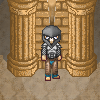
The roof does not fit the lower part. I think it would look better when both would use the same color palette.
Another problem is of a more architecture-related kind: the roof is only on one half of the pillars.
But you did a good job with the engravings on the front.
former Manasource Programmer
former TMW Pixel artist
NOT a game master
Please do not send me any inquiries regarding player accounts on TMW.
You might have heard a certain rumor about me. This rumor is completely false. You might also have heard the other rumor about me. This rumor is 100% accurate.
AxlTrozz: I like the overall shape of the building. Also I think the roof is a good place to improvement - I would see there some ceramic roof tiles. I must say that I don't like shadows, they are standing out too much, they look just like cut out from background. Maybe something more blurry would help. Remember that edges of shadows according to our guidelines should be on 15% opacity. Ornamental addons on side wall of roof should have more detail IMO.
I appreciate your engagement in graphics development, and I believe in you. It's good to see progress in your works. Keep doing good job.
EDIT:
quick mock up, feel free to use and edit.
library01-rooftile.png (42.88 KiB) Viewed 7130 times
I noticed that I misjudged angle of the roof. Difference is about 1 deg. It may be masked with roof border tile.
I tried to improve the engraving a bit, also reduce the shadow but remember with a white background the shadow stands more, this is the new version, and thank you for you help and support
From technical point of view, we should halt for a while developing this tileset until we finish roof tiles. I suggest a bit different angle to improve tileability - making this tiles more useful for different buildings.
According to tile size (32px) IMO we should split roof angle between 4 tiles. Lines are straight - made from 4px lines. We possibly could add some anti aliasing on this, but for developing tileset it is not necessary now. Check the angle and tell me what you think.
roof-reference.png (734 Bytes) Viewed 6973 times
Here is new roof. I enlarged roof tile. Isn't it too big? What do you think?
Iru, Thank you, I knew something was wrong when you mention it but I was unaware about the angle, I used Gimp with the Shift-Ctrl line draws ( or I'm not that good on it yet ), but taking hands on the issue, I'll take the images (roof) you posted and I replace them, then I can work with AA
Edit : also I think we can improve the detail level on the individual tiles and light reflection
Angeliex wrote:It looks a lot better. The ancient city could use a fancy fountain. Sorry for not making it but I can't match your technique.
I made some line-art for the base of the fountain but it is way to small:
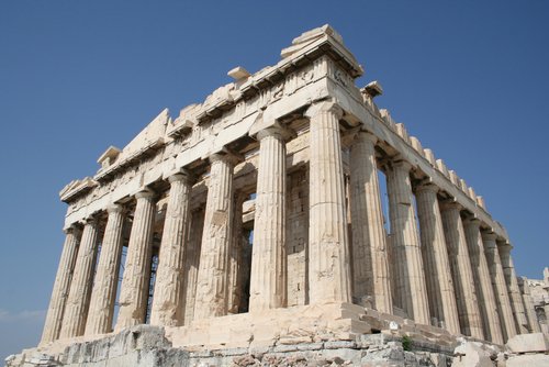
Also the buildings should have a lighter limestone color like this :http://www.planetware.com/i/photo/acrop ... -gr003.jpg.
I have a basic fountain shape,
It was intended to be used indoors so is dark, and have not much ligth reflection, I personally like the actual color but I'll try to create a variation to be used outdoors,
Once is finished may be one developer/mapper can create a particle effect


