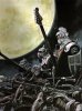


Temple Column Idea
Minor correction: The default light source is from the south-west, not the south-east.Crush wrote:First thank you for your effort. I think your column is a very good start and shows that you got what it takes to create map tiles. But to make it fit into the rest of the game there are some details that have to be fixed.
First the perspective. In TMW we are trying to use a perspective from a 45° angle. That means a horizontal circle, like the top and the bottom of the column, should have an aspect ratio of about 3:4 or 2:3 (the optimum would be sin(45°) but you don't have to be that exact).
Then the light direction. In TMW we have a light source from southeast. But this column is lit from the center.
And then there is this bright vertical line in the center. That looks really strange. I would either move the two halfs of the column together to remove that line or make it darker instead of brighter.
When you are able to make these changes then this column would be a perfect part of a desert temple.
One more tip: If you multiply the width by 0.7, you find out the height. Thus, in a circle, if the width is 20, the height should be 14. That way, everything remains consistent and at an (almost) perfect 45 degree angle. Hmm, I do indeed like your work, it'd be interesting to see it implemented. There are other guidelines and tips on the Wiki if you're interested.eman wrote:Thanks Crush for your critique and advice, we'll be working on the suggested changes. Thanks to Pauan as well, we noticed that light source direction in the game too.
Creating a shadow is a quick 5 minute job. In fact, it wouldn't be hard for me to add shadows to ALL the current tile-sets, so I wouldn't worry about it too much.BadMrBox wrote:It looks nice but it should probably cast a shadow. Damn, I miss that function that is availble on the pixelation forum. It enlarges the images if you left click on it. A very good function. If there is such a function for phpbb our admins should think about installing it.

This shouldn't be necessary when you are using a good browser.BadMrBox wrote:It looks nice but it should probably cast a shadow. Damn, I miss that function that is availble on the pixelation forum. It enlarges the images if you left click on it. A very good function. If there is such a function for phpbb our admins should think about installing it.
Yes, I do think so. Right now I would say it's nearing completion, but still needs tweaking. As I already said, adding a smidgen of anti-aliasing would be good, and I can suggest some further modifications. For instance, I feel the right side should be a teensy bit darker, otherwise it ends up looking too flat. Also, there is a shadow right underneath the upper-part of the pedestal, as there should be. However, I noticed some inconsistencies. Also, the lighting on the top of the pedestal looks very strange. Well, ok, not VERY strange, but still a tiny bit strange. I would look into that. Perhaps try making the highlight a little bit more circular and less oval-like? Fix those things up and I'm sure it will look far better.AxlTrozz wrote:Pauan and Crush:
Thanks for your help, actually this is our first experience with pixel art and things like shadows are not that easy for us yet.
Crush:
I agree with you, the first version have better texture but we sacrifice the texture in order to get the light effect (well that happened when we tried to add the light).
You think should we try to improve the second version ?