Hi to all, make sure you read the entire post before jumping to the picture and comment as we need to focus on the ergonomics of menu mechanism,
The objective of the redesign is to ameliorate the retention rate of people visiting the website by using a more modern look and better ergonomics. I do not have access to the Analytics data at the moment, so it is difficult for me to evaluate if current retention rate is deficient or not. Please not I used a flickr image too small for the final design, I will take a good picture myself in a superb emplacement near me.
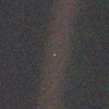
I prepared a mockup for the general design and menu system I propose to make the website more user friendly. I do not have the original files for the logo in hands at the moment so it is simply missing. The goal of the new menu system is to make as much information available to the user in the simplest way possible using a "big menu". The bottom of the design (missing from the mock-up) would contain links to social media accounts, various links used on the current design and a subtle text-based sitemap.
The home page would contain a paragraph of text explaining what is The Mana World, recent game news, randomized players testimonies and randomized screenshots.
Menu operation
When a user hover over one of the 4 elements of this big menu, a panel would appear with the most relevant information. If the user click on the element, it would direct him to a page containing similar content with more details.
PLAY THE GAME
- Registration using AJAX to catch the result (creation success or failure) and display it in place of the form. Since recaptcha uses Javascript this should not be an issue. A warning to enable Javascript would display if the user disable Javascript.
- Download links
READ THE MANUAL
- Direct links to the most important articles in the wiki addressing the players.
CONTRIBUTE TO THE PROJECT
- All the developer tools and most important wiki articles addressing developers would be located there
ABOUT
- History of the project, some logically integrated landing pages to target additional search keywords such as "MMORPG, what is that?" to try to get better visibility on search engines.
I awaits your comments eagerly (going to bed dont expect immediate feedback from me...)
-gagolthegreat AKA Jimbo rinfrette
Website Redesign Proposal : Big Menu
-
gagolthegreat

- Peon

- Posts: 45
- Joined: 08 Jun 2012, 02:35
Website Redesign Proposal : Big Menu
- Attachments
-
- Mockup of the menu system I propose
- twm-website2012-V001.jpg (216.55 KiB) Viewed 7149 times
Last edited by gagolthegreat on 16 Jun 2012, 18:38, edited 2 times in total.
Re: Website Redesign Proposal : Big Menu
Hm. This does not really look like a website of a fantasy game to me.
Re: Website Redesign Proposal : Big Menu
I really like the layout, and the energy of that design.
I think it would make the site seem much more "active" to include news and testimonials too.
Thanks for getting involved, gagol!
I think it would make the site seem much more "active" to include news and testimonials too.
Thanks for getting involved, gagol!
You earn respect by how you live, not by what you demand.
-unknown
-unknown


Re: Website Redesign Proposal : Big Menu
I like the concept, but I agree that as presented it seems like a big jump from what the game currently is. This may be due to the use of real world graphics in the background. Personally, I think this would set unrealistic expectations for new visitors. Glad to see somebody taking the initiative though. Can't wait to see some progress.
The only stupid question is the one you don't ask.
-
gagolthegreat
- Peon
- Posts: 45
- Joined: 08 Jun 2012, 02:35
Re: Website Redesign Proposal : Big Menu
We have to keep in mind this is to present the menu system. The big white square appears only when mouse go over a menu item. News, testimonies and screenshots will be prominent on home page.
Re: Website Redesign Proposal : Big Menu
Can't you put the website somewhere so everyone can try?
-
gagolthegreat
- Peon
- Posts: 45
- Joined: 08 Jun 2012, 02:35
Re: Website Redesign Proposal : Big Menu
This is only a picture at the moment... if we decide to go forward I will implement in a static html and then into whatever cms we decide to use if any. Note that such custom big menu do not integrate well into systems such as wordpress. Perhaps we can identify the portions we want to be user editable and create a simple system to make update less painful, That would be much simpler fir end-users than one-size-fit-all solution that tends to have a zillion options to enable flexibility...Ablu wrote:Can't you put the website somewhere so everyone can try?
I can work on content presentation mock-up tomorrow and have two pictures to compare.
Last edited by gagolthegreat on 16 Jun 2012, 17:47, edited 1 time in total.
-
Chicka-Maria

- TMW Adviser

- Posts: 1562
- Joined: 19 Feb 2010, 02:10
- Location: Internet
Re: Website Redesign Proposal : Big Menu
I think it might be better if the background style was close to tmw's 2D style, im not really feeling this as a 2D MMORPG website, But maybe with some more progress it will.
Regards,
Regards,
Yubaba
TMWC Member of The Mana World
Leader of The Mana Empire (TME)
[19:41] Ladysugar: he told me to push a setzer up his rear
www.deviantart.com/comfycheeks - Old Deviant Art
TMWC Member of The Mana World
Leader of The Mana Empire (TME)
[19:41] Ladysugar: he told me to push a setzer up his rear
www.deviantart.com/comfycheeks - Old Deviant Art
William James wrote:Act as If what you do make's a difference, because It does.
-
gagolthegreat
- Peon
- Posts: 45
- Joined: 08 Jun 2012, 02:35
Re: Website Redesign Proposal : Big Menu
I understand some people feel the look will not represent TheManaWorld at its best, this is something we can work out easily once ergonomics are sorted out. My main concern is the usability of the menu system I propose. I would appreciate greatly your comments about it.


 Re: Website Redesign Proposal : Big Menu
I do like the general concept and agree with Frost. Thank you for the job
Actual menu:
Nard
Actual menu:
- Registration
- Downloads
- News
- About
- Servers
- Wiki
- Forums
- Bug tracker
- Links
- SourceForge.net
- No software patents
- GPLed project
- ManaSource user
- Server status
- Register new account
- I'd like to see an About us on this welcome page which describes the project and the different teams, it's open source nature and how to contribute ( it is also on the wiki by the way)
- I think the second menu could be better(?) entitled "when you get lost" :
- Read the wiki
- Read and post to the Forum
- Under the "play the game" menu I would like also to see links to
- game news
- TMW server status
- and online players
Nard
-
Big Crunch

- TMW Adviser
- Posts: 1056
- Joined: 16 Dec 2009, 22:52
Re: Website Redesign Proposal : Big Menu
AS Some one who prefers a simplistic view I love the hovering menu and the clean clear look. I think the hovering menus will help achieve that simplicity, rather than having a clickable link in a list.
sexy red bearded GM

Re: Website Redesign Proposal : Big Menu
Definitely not a photorealistic background, I hate that kind of false advertising. Keep the current logo, though maybe replace "in development"?
Maybe a map or screenshot à la http://www.bay12games.com/dwarves/ ... but we definitely don't want large download times.
I'm not really a fan of hovering things, they always seem to be fragile and I hate how it breaks the browser's "back" button.
Maybe a map or screenshot à la http://www.bay12games.com/dwarves/ ... but we definitely don't want large download times.
I'm not really a fan of hovering things, they always seem to be fragile and I hate how it breaks the browser's "back" button.
Former programmer for the TMWA server.

Re: Website Redesign Proposal : Big Menu
The design is awful. The 4 parts already exists, the idea to group them is good. but not with this design.
-
gagolthegreat
- Peon
- Posts: 45
- Joined: 08 Jun 2012, 02:35
Re: Website Redesign Proposal : Big Menu
Hi Milla, the background image can be changed with ease... I will work on more mock-ups tomorrow. I would like if possible, for you to elaborate what you dont like and how you think it can be improved.Milla wrote:The design is awful. The 4 parts already exists, the idea to group them is good. but not with this design.
Thank you!
-gagolthegreat
-
gagolthegreat
- Peon
- Posts: 45
- Joined: 08 Jun 2012, 02:35
Re: Website Redesign Proposal : Big Menu
The hovering is an addition... it will be possible to just click on the link. And nothing is stopping us to keep a list of links in the right sidebar for a more traditional navigation style. The goal is to make it as easy as possible for newcomers to find the information they need in an intuitive way from the homepage.o11c wrote: I'm not really a fan of hovering things, they always seem to be fragile and I hate how it breaks the browser's "back" button.
-gagolthegreat