Page 1 of 5
New website design
Posted: 27 Mar 2005, 00:18
by Bjørn
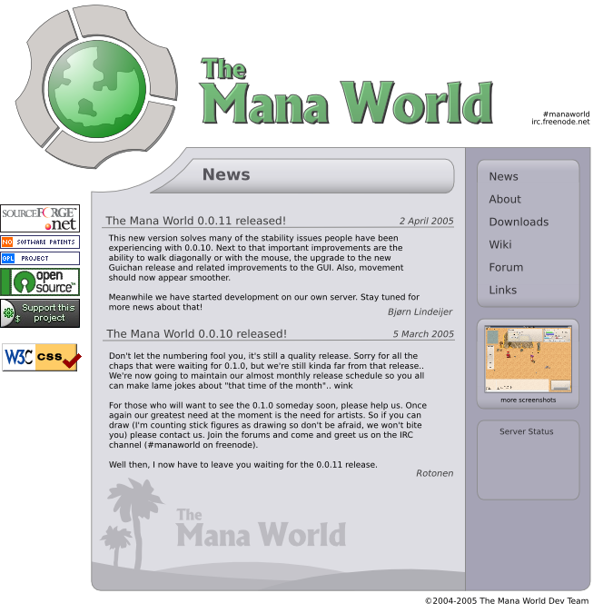
Although I've made quite a few fixups and simplified much of the code, I am still not happy with our current website, because it's messy (inconsistent, too square, too many lines, strange colors, etc). Now I know the logo hasn't been decided yet, but while fiddling with it I couldn't help myself and I went on to do a redesign of the website. Here's a small thumb, click for a larger image:
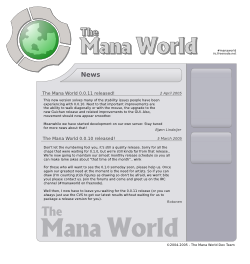
I'd like to know what people think about it, and wether it could be accepted as our new website, and which modifications people would like to see.
The design in SVG format:
http://www.lindeijer.nl/~bjorn/tmwwebsite.svg
Here's a
small variation.
Posted: 27 Mar 2005, 06:20
by i
it needs some fixes IMO.
Posted: 27 Mar 2005, 09:10
by ElvenProgrammer
Maybe more colors could help a bit?
Posted: 27 Mar 2005, 10:38
by Bjørn
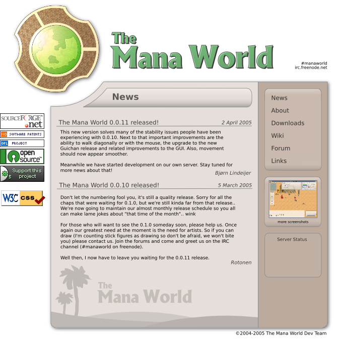
In response to comments bij Elven, I've saturated the purple a bit more and added some color in the title. I've also added menu items, screenshot and banners:
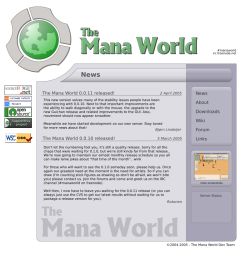
Again, SVG version (without the banners, I added those in GIMP):
http://www.lindeijer.nl/~bjorn/tmwwebsite_r2.svg
Posted: 27 Mar 2005, 10:46
by maci
wow i like this one
Posted: 27 Mar 2005, 12:16
by Bjørn
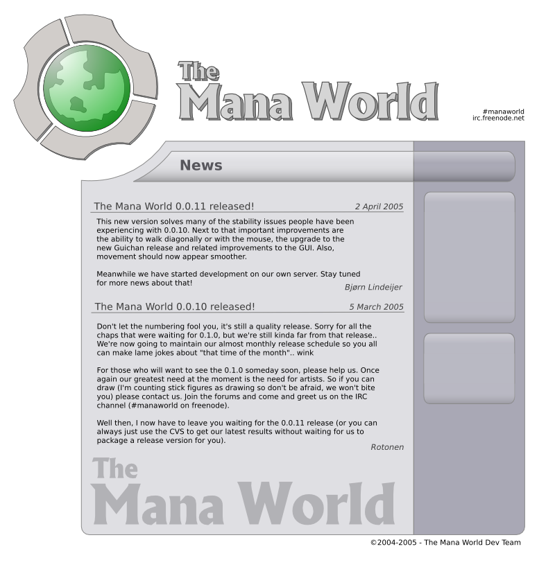
Alternative footer and header:
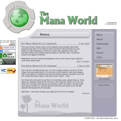 http://www.lindeijer.nl/~bjorn/tmwwebsite_r2_alt.svg
Here I also gave the logo a slight turn to put it more straight, I think it looks a bit better:
http://www.lindeijer.nl/~bjorn/tmwwebsi ... rntest.png
Posted: 27 Mar 2005, 14:16
by Pajarico
I like it

Posted: 27 Mar 2005, 15:43
by ElvenProgrammer
Just a random thought: maybe we could add some characters images in the footer instead of the text
Posted: 27 Mar 2005, 17:21
by Rotonen
It's starting to look a lot less scifi with the saturation and colorlevel changes. Not perfect yet, IMO. (Sorry, it's an annoying opinion since I cannot tell you what to change/add/remove.)
Posted: 27 Mar 2005, 18:08
by Pajarico
A suggestion: Make the "Mana World" on the top less opaque and add some blur shadow.

Posted: 27 Mar 2005, 19:40
by maci
hmy yeah maybe oange is a good idea
Posted: 27 Mar 2005, 23:07
by HaLLanHype
Its looking pretty good just some changes.
Posted: 27 Mar 2005, 23:48
by Bjørn
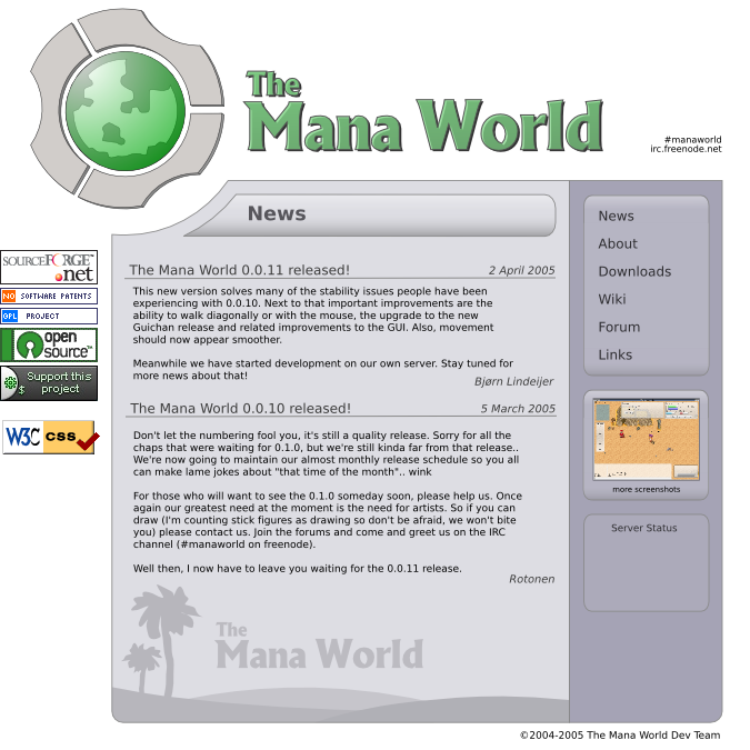
I've adapted the site to the latest version of the logo as posted by Irukard
here. It's not the final version of the logo and probably he'll make one at exactly the right size so that it doesn't need to be scaled:
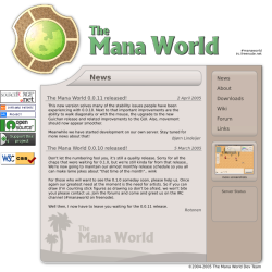
To better match with the logo the color moved from blueish to brownish, and I've added a crude dropshadow to test the effect. I am at my parents and had to work with GIMP instead of inkscape, so I didn't adapt the title but otherwise I'd have tried the dropshadow there too.
Thanks for all the ideas, it's really appreciated.
Posted: 28 Mar 2005, 01:38
by nym
Wow, thats 100% better

It looks really good -- only one last suggestion

(hehe). I would probably remove (or lessen to barely see'able) the gradients from the "News" title and the menu backgrounds on the right side. The gradients are about the only thing making it still look futuristic (the smooth curves also, but that is mostly negligable).
The color scheme is much butter imo, as it fits the context better as a fantasy role playing game (yes, changing the base color can have that effect). You also may want to play around with some other things, like news footer ("The Mana World" with hills and trees) color, maybe adding a tint of green to the leaves, and maybe adding some yellow the the hills to look more like sand (or green if you want
). Another thing you could play around with is the background color of the pages, try maybe an off-white color.
Very good work Hammerbear
Posted: 28 Mar 2005, 08:53
by i

