Thanks for those, Irukard. Did you notice I turned the logo a bit though? I do prefer it when put "straight", especially on the website.
nym, thanks for your comments. I'll be sure to try a version without the gradients, and see about trying something else with the white background. I'm not sure if I'll add more color to the footer, I've deliberately not used any color there and just brightness changes.
New website design


-
Bjørn

- Manasource

- Posts: 1438
- Joined: 09 Dec 2004, 18:50
- Location: North Rhine-Westphalia, Germany
- Contact:
Hmm I have no intention of changing the forum theme unless there'd be a very high demand. The default phpBB theme looks fine and I think it'd be enough to plug in our new logo when it's finished.Rotonen wrote:So perhaps while you're at it, you could patch together a forum theme conceptualization out of the final version of the website conceptualization..?
It's not that it's a problem, I'd modded/skinned phpBB before (see for example http://forums.rpgdx.net/), but it's just loads of work.
Well I just would've liked to have seen what the forums would look like in the conceptualization, that isn't excessive work, is it? Of course I wouldn't like you to do it: you're already busy with other stuff and we shouldn't waste your efforts on actually modding phpBB to the new theme. We should just find someone else competent enough to do it if people like the conceptualization.
-
Bjørn
- Manasource
- Posts: 1438
- Joined: 09 Dec 2004, 18:50
- Location: North Rhine-Westphalia, Germany
- Contact:
Hmm I'll think about doing forum mockup thing.
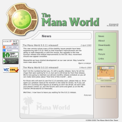
Today I put together a version with the new logo without the gradients and with a not-so-white background. I've also aligned the location and size of the elements to a pixel grid, so lines are sharper now:
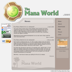
Vector version:
http://www.lindeijer.nl/~bjorn/tmwwebsi ... nograd.svg
More color version:
http://www.lindeijer.nl/~bjorn/tmwwebsi ... _color.png
Probably the colors could still use some tweaking. Other comments welcome too.
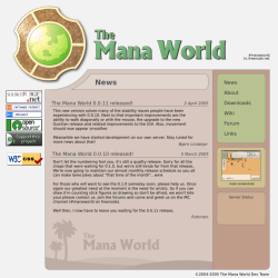
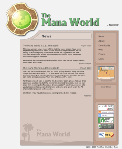
-
Bjørn
- Manasource
- Posts: 1438
- Joined: 09 Dec 2004, 18:50
- Location: North Rhine-Westphalia, Germany
- Contact:
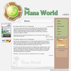
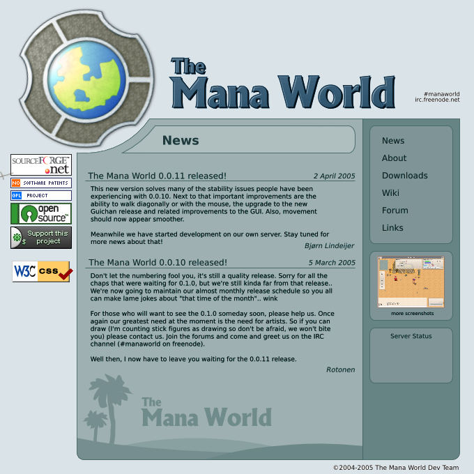
Btw I'd probably like to move the banners to a different location:
I also think we have a few superfluous banners. For example "GPL project" and "Open Source" are not that important (and first implies second), and that'll be mentioned on the about page. Further more I question the value of advertising W3C CSS compatibility, the site looks good and standard are a given, as an alternative we could link to it more discretely using a text at the bottom. Lastly, we are not relying on donations nor using them in any important manner, and we have enough money for now at least to pay for our own domain, so I suggest we also get rid of donation button on main site (it'll still be on SF project page).
I also think we have a few superfluous banners. For example "GPL project" and "Open Source" are not that important (and first implies second), and that'll be mentioned on the about page. Further more I question the value of advertising W3C CSS compatibility, the site looks good and standard are a given, as an alternative we could link to it more discretely using a text at the bottom. Lastly, we are not relying on donations nor using them in any important manner, and we have enough money for now at least to pay for our own domain, so I suggest we also get rid of donation button on main site (it'll still be on SF project page).
-
HaLLanHype
- Novice

- Posts: 184
- Joined: 10 Mar 2005, 00:58


-
ElvenProgrammer

- Founder

- Posts: 2526
- Joined: 13 Apr 2004, 19:11
- Location: Italy
- Contact:
About the banners: well we can easily remove them from the right column but it should be stated clearly we're an open source project and we're using gpl license in the about section. A lot of people complained in the emails they sent me that it was hard to find this was a free project before adding those banners. You want to remove the CSS compatibility? No problem to me. The donation button? I suppose the sourceforge project page is not that visible for people not coming from sf, anyway we're not here to gain from this project and if people want to donate they'll find a way to do it. (Just a suggestion, maybe we could move the button to somewhere else, the about section?).
 Just don't remove the sourceforce logo
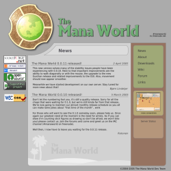
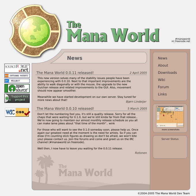
About the color combination sincerely I still have to understand which one I prefer, but I think the last one you posted with the banners on the right side is the less dangerous one. Probably I'm getting used to those pale colors.
Talaroc: I'm with you, I already suggested this way, having more color combinations could be cool.
 TMW Italian community
-
Bjørn
- Manasource
- Posts: 1438
- Joined: 09 Dec 2004, 18:50
- Location: North Rhine-Westphalia, Germany
- Contact:
Well the site will be HTML/CSS based so sure I could include a few color shemes. Still I feel this would be more interesting from a accesibility point of view and not really suitable for people's tastes, I think uniformity is more important there.Talaroc wrote:I haven't really bothered to look through the site code, but if you're using a CSS-based approach, you could include all of these color combos (as well as perhaps a few alternate layouts) and just let the user pick...of course, you'd still need a default.
Note that this is just the design, I haven't started implementation of the site yet.
-
ElvenProgrammer
- Founder
- Posts: 2526
- Joined: 13 Apr 2004, 19:11
- Location: Italy
- Contact:


-
ElvenProgrammer
- Founder
- Posts: 2526
- Joined: 13 Apr 2004, 19:11
- Location: Italy
- Contact: