my attempt at a new monster

Content and general development discussion, including quest scripts and server code. TMW Classic is a project comprising the Legacy tmwAthena server & the designated improved engine server based on evolHercules.


Forum rules

This forum houses many years of development, tracing back to some of the earliest posts that exist on the board.

Its current use is for the continued development of the server and game it has always served: TMW Classic.

User avatar
Crush
TMW Adviser
TMW Adviser
Posts: 8046
Joined: 25 Aug 2005, 16:08
Location: Germany

my attempt at a new monster

Post by Crush »

the lack of new monsters, especially some that fit into a forest enviroment, is really blocking the contend development of tmw. there could have been the first forest map in the last release and some more in the upcomming. but because we haven't got any monsters to populate them, despite my begging and pleading for months, the release of the new areas has to be delayed again.

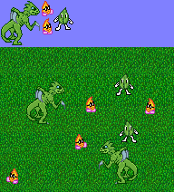
so i decided to try making some monsters myself.

this is a completely new field of pixel art for me. so i studied some sprites from snes rpgs and tried to adopt some techniques. this abomination of nature, which is meant to be some kind of dinosaur / lizard like predator, was the result:
Image
i know that it doesn't look good, but because there is noone else who wants to make monsters we got to make the best out of it. with your help i can maybe make an at least decent looking sprite out of it. so i would like you to tell me what looks good (and why), what looks bad (and why) and give me some hints and suggestions what i could do to improve it.


but of course i would appreciate it even more when someone with more experience on this field would contribute some new monsters. i am dreaming of playing in the new forest enviroment for months and i am sure i'm not the only one who is sick of the dull desert.
Last edited by Crush on 06 Nov 2005, 04:15, edited 1 time in total.
User avatar
Tenche
Warrior
Warrior
Posts: 421
Joined: 14 Jun 2005, 20:21
Location: Reston
Contact:

Post by Tenche »

ooo mabby these could be in one of the caves
in the desert with the snakes it looks like a good monster!
godHead
Peon
Peon
Posts: 12
Joined: 19 Jul 2005, 07:54

Post by godHead »

i think it looks good. but the head looks disconnected (neck too long?) the edges need smoothing and add the opposite limbs. i can only critique cause, well, i suck at pixle art(PA)
User avatar
Modanung
Grand Knight
Grand Knight
Posts: 1719
Joined: 20 May 2005, 15:51
Location: Groningen, The Netherlands
Contact:

Post by Modanung »

Crush wrote:...because there is noone else who wants to make monsters...
Now there's a total rubbish line.

The projection is too much from the exact side, it should be slightly more from the top. The neck is too thin. I think the whole thing would fall over like this; it's unbalanced.
The highlights are sometimes misplaced, too bright and too sharp. All lines could use anti-aliasing.

About the colour... you said it was a forest creature. You remember your grass being fully saturated green? How do you think this monster would look on that grass?

Rotonen would probably say it's not alien enough. And I suggest you do some concept art before you start with the pixel-art part.

Overall it's not bad though.
If you're looking for 3D FOSS games be sure to check out LucKey Productions on itch.io
User avatar
Crush
TMW Adviser
TMW Adviser
Posts: 8046
Joined: 25 Aug 2005, 16:08
Location: Germany

Post by Crush »

Modanung wrote:The highlights are sometimes misplaced
which do you mean exactly and where exactly should they be?
User avatar
ElvenProgrammer
Founder
Founder
Posts: 2526
Joined: 13 Apr 2004, 19:11
Location: Italy
Contact:

Post by ElvenProgrammer »

About the lack of monsters for the woodland environment, well I know neko-mon is busy and is having problems with connection, but he assured me he will complete his mushroom type monster. Someone else was working on a plant type monster, but I didn't have further news from him.
Regarding your monster I'd say you could improve it desaturating the color a bit and using a less bright color, at least according to my taste. Actually it seems a bit plastic made. About the shape I'd like to see the other leg a bit, that would give him some more stability. I don't like the arm to go upward right at the beginning and you could bend the knee a bit more.
Anyway the overall look is not bad at all. It's nice to see that at least you're working and we could hope to release a woodland map soon.
User avatar
Rotonen
TMW Adviser
TMW Adviser
Posts: 3154
Joined: 08 Sep 2004, 19:48
Location: Bern, Switzerland

Post by Rotonen »

Actually: too Alien. At least this reminds me of the movie creatures a lot.

And how about making it a bit less shiny? A leathery surface could be nice for this one.
This message used to be meaningful.
User avatar
Modanung
Grand Knight
Grand Knight
Posts: 1719
Joined: 20 May 2005, 15:51
Location: Groningen, The Netherlands
Contact:

Post by Modanung »

It reminded me of Alien, Star Craft and Jurassic Park at the same time.
If you're looking for 3D FOSS games be sure to check out LucKey Productions on itch.io
User avatar
criptos
Novice
Novice
Posts: 75
Joined: 20 Sep 2005, 16:00
Contact:

Post by criptos »

Modanung wrote:It reminded me of Alien, Star Craft and Jurassic Park at the same time.
It remainded my sister... specially those redish eyes...
*shudder*

But for the critics: Skin texture. Desaturating the green and adding spots of shadowed green at the skin... so they looks like camouflage...

The tail, should face UP, becose tail, for the idea of dinosaurs, is to stabilize, also, facing up means alertness, and the way the tail is drawn, doen´st help for the "look bad", also you could add the "new feather thing" about dinosaurs :)

Make the neck ticker, so it isn´t lost at the downsizing..

The red eyes, didn´t like me.. they aren´t needed to show badnness... the pointy hands are good enough and the mouth full of teeth do the "look bad" trick.
May the Source be With You
User avatar
Ultim
Novice
Novice
Posts: 230
Joined: 02 Jul 2005, 07:20
Location: USA
Contact:

Post by Ultim »

Image
i'm just goofin'. New boot goofin'.
User avatar
Crush
TMW Adviser
TMW Adviser
Posts: 8046
Joined: 25 Aug 2005, 16:08
Location: Germany

Post by Crush »

wow, that looks really good. i can't believe that it is based on my pic.

do you have the time to animate it or may i try?

there is just a little style change i would like to suggest. i think it looks too evil for a game in the tradition of the squaresoft rpgs. maybe we should change the eyes a little bit to make it look a little bit more "cute". what's the general opinion about that?

the face expression i have in mind is something like this monster sprite from ragnarok online:
Image
User avatar
Jetryl
Novice
Novice
Posts: 113
Joined: 16 Mar 2005, 20:55

Post by Jetryl »

As was said before, the angle needs to be from 45° in-front/above. The far foot should show up with it's bottom about a pixel or two (or more) above the near foot, to account for perspective.

Also, take a look at that ragnarok online sprite and notice how much they lighten things for the highlights and how much they darken things for the shadows.

Their shadows are not very pronounced at all (which is good), and their highlights only go on the shiny stuff.


If you have highlights on things which are not shiny, then they need to be very close in luminosity to the non-highlighted stuff, or the thing will look like it's made of shiny plastic.
User avatar
Pajarico
Knight
Knight
Posts: 592
Joined: 28 Feb 2005, 19:29
Contact:

Post by Pajarico »

My view :wink:
Image
PD: Is that alien enough, Rotonen? :lol:
Lv.: Maggot
Please, read the FAQ before posting.
User avatar
Ultim
Novice
Novice
Posts: 230
Joined: 02 Jul 2005, 07:20
Location: USA
Contact:

Post by Ultim »

do you have the time to animate it or may i try?
Of course you may. Open Source. Gratis. My work is your work. My pixels are your pixels.

However i'd wait (heck, of course i would, i am) until the concept's finalized to animate or anything. It really takes it out of you to complete all the frames and have that one higher-up say "that sucks, we're not using it."
User avatar
Modanung
Grand Knight
Grand Knight
Posts: 1719
Joined: 20 May 2005, 15:51
Location: Groningen, The Netherlands
Contact:

Post by Modanung »

...Or thinking of a design improvement yourself and having to edit every frame.
If you're looking for 3D FOSS games be sure to check out LucKey Productions on itch.io
Post Reply