Page 2 of 3
Posted: 09 Nov 2005, 14:25
by xand
Great Monster.

Please Admins tell if you like it, so we get it ingame soon
Posted: 09 Nov 2005, 17:49
by Crush
my "cute" version next to ultims version:


note that the impression is completely different although i just changed the eyes, the mouth and the nose a little bit and did nothing to the body.
maybe we should find a consensus about the way how the eyes of all monsters should look, because the eyes are the most important part when it comes to the general style.
Posted: 09 Nov 2005, 18:04
by Ultim
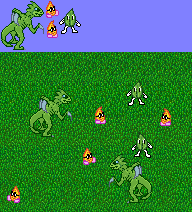
Cuter. Now with little fireguys and leaf-dudes.
(At the time of this post, the two files are somehow crossing and messing up Crush's post. Sorry, Crush)
Posted: 09 Nov 2005, 19:02
by xand
To be honest: Those fireguys and Leaf-Dudes look a bit weird, and
a bit plain.
Posted: 09 Nov 2005, 19:03
by Crush
fixed. stange. i could have sworn that i already replied to this. maybe i closed it accidently instead of posting it.
the "leaf dudes" remind me of the early (very early) walt disney cartoons.
i'm quite indifferent about the "flame guys".
i don't like what you did to the body shading of the predator. with only 2 different colors it looks very flat and 8bit.
but your new face is another good draft. i would like to hear some opinions about all 3 drafts. not only if they look good or bad. i would like to know what they would "say" to you, when they could speak. to me they say:
"you dare stepping into my lair? You will suffer endless pain for this!"
"aww, a ball! wanna play! wanna play!"

"hmm, a human wandering in my hunting grounds. i think i could beat him when i attack in the right moment."
Posted: 09 Nov 2005, 21:33
by Ultim
Very flat and plain, indeed. i was looking at some of the graphics we have made, and their intricate, heavily-shaded designs make them look too crowded and busy. The most recent redo i did of the creature got rid of most of what i call "excess coloring." You get used to believing, as a pixeller, that if you change one pixel the entire work will be changed. However, with so much detail you can change large sections of any given piece and the change will go unnoticed because the viewer is already visually drowned in detail. i think less intricate graphics will contribute more to the overall look of the game. Less is more.
Posted: 09 Nov 2005, 23:33
by Crush
i made an attack animation:

Posted: 10 Nov 2005, 00:53
by Rotonen
It's a bit static, don't you think?
Posted: 10 Nov 2005, 06:18
by Ultim
Looks beautiful. The static thing would be a quick fix- just make him lunge forward. Not too much work there.
Posted: 10 Nov 2005, 07:05
by Ultim

Front view of the Predator
By the way, the creature is imaginative. "Predator" is not so much. How about something else? How about "Crultim" after the collaboration?
Posted: 10 Nov 2005, 11:12
by Modanung
He doesn't seem to be standing very... stable. In the side view his paws/feet were pointing outward giving a more stable feel.
Also with a bit more shading the shape could be more clear by adding some depth. As it is now it could be a goblin with horns.
Posted: 10 Nov 2005, 17:13
by Crush
Ultim wrote:
Front view of the Predator
the eyes and the tail look different than in the side version and the inner sides of the legs could be bend.
Posted: 10 Nov 2005, 18:03
by Pajarico
maybe we should find a consensus about the way how the eyes of all monsters should look, because the eyes are the most important part when it comes to the general style.
I don't see why should, also I don't care if there are monster that look scary and others that look goofy as long as we keep some diversity.
Posted: 11 Nov 2005, 21:22
by HaLLanHype
Ultim wrote:
Cuter. Now with little fireguys and leaf-dudes.
(At the time of this post, the two files are somehow crossing and messing up Crush's post. Sorry, Crush)
ha I like the leaf guy
we should have a monster like spot. (who was the 7up mascot.)
Posted: 11 Nov 2005, 21:44
by Modanung
I think the leaf and the flame are too Mario/Keen-like in style.
...yes I think that's bad in this case.