Page 12 of 16
Posted: 20 May 2006, 15:46
by ElvenProgrammer
Yep that fits a lot better.
Posted: 20 May 2006, 16:01
by Matt
It's a lot nicer now.
Posted: 20 May 2006, 18:14
by Crush
a palisade inspired by irucards nomad tileset:

Posted: 20 May 2006, 18:44
by Modanung
Looks nice (the palisade). But maybe the poles should have sharpened tips?
And ofcourse there should be grass growing against it, just like with the house and the cliffs.
Posted: 20 May 2006, 19:16
by Crush
this is usually the last step i do after everyone had the opportunity to suggest changes.
Posted: 21 May 2006, 07:42
by Techsetsu
^ Yeah I agree. The logs would look better sharpened. You might also want to throw in
Crush wrote:modified the fence to fit the rest of my tiles:

Nice, but could you maybe add a gradient or something to the roof so it looked less flat and repetitive? I do really like the A-framed roofs though [despite the fact I think the straw would look cooler if it were darker... hehehe].
All in all, excellent work. I love the window and door. I also really dig the barrel. I do think you should take up
Yosuhara's vines too. That'd make a nice addition.

Posted: 21 May 2006, 10:21
by Crush
Techsetsu wrote:Nice, but could you maybe add a gradient or something to the roof so it looked less flat and repetitive?
No, i want it to be tileable. Using a gradient would limit it to a fixed height.
Posted: 21 May 2006, 18:54
by Techsetsu
Crush wrote:Techsetsu wrote:Nice, but could you maybe add a gradient or something to the roof so it looked less flat and repetitive?
No, i want it to be tileable. Using a gradient would limit it to a fixed height.
Could you maybe make a semi-trasparent gradient overlay then?
Or try making the cabin with the darker shade of the straw? Something just doesn't look right...
Posted: 25 May 2006, 17:35
by Crush
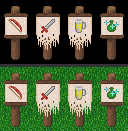
some signs i made. please give me your honest opinion:

i would also like to hear some suggestions what other signs could be useful.
Posted: 25 May 2006, 17:48
by EJlol
a armor shop
Posted: 25 May 2006, 20:15
by yosuhara
Crush wrote:some signs i made. please give me your honest opinion:

i would also like to hear some suggestions what other signs could be useful.
that bow on the first sign is almost invisible... i think u should adjust it's brightness... same to sword on second sign, blade is ok.
Posted: 25 May 2006, 23:34
by Rotonen
I think the actual sign part could (and should) be bigger. (I think it'll look nicer and also allow more detail.)
Posted: 26 May 2006, 02:37
by Modanung
And I agree with Rotonen. The sign should be the entire width of the tile. And I think it's too tall, the pole should be shorter. Signs that high should be attached to a building. Either nailed to the wall or attached to some sign bar thingy sticking out of the wall.
Also I think it should look more as if they were painted... decoratively. Less shaded, lined out, and the shading of the wood should be visible through the paint.
Posted: 27 May 2006, 21:39
by Ultim
May i suggest moving in this direction?

Oh and Crush, on your palisade the logs lined horizontally have a smaller vertical thickness than your logs lined vertically, giving the piece a grid effect on the corners.
Posted: 15 Jun 2006, 13:25
by Crush
Sorry for not posting anything for such a long time, but im in a rather heavy creative block right now. This is what i have so far. When anyone got any ideas what i could add then please post. i really need some kind of inspiration.


