Page 4 of 16
Posted: 27 Jan 2006, 17:24
by Pajarico
Crush wrote:the architecture looks interesting but it looks so narrow. it would be very uncomfortable to live in a house like that.
Rotonen wrote:Well it is a CONCEPT piece, you don't have to pixellate it 1:1, IMHO..

I think our pixellation process would be a lot faster if we had more of these conceptual pieces defining stuff for people. *hinthint*

Exactly
Posted: 30 Jan 2006, 14:46
by Crush
are there any ideas how i could improve the straw texture?
or any ideas what other stuff would be useful for a town tileset?
Edit:
the pole and rock approach (hack job):

Posted: 30 Jan 2006, 19:08
by ElvenProgrammer
Crush wrote:are there any ideas how i could improve the straw texture?
Hmm no sorry, but maybe you could use a better shading instead of isolated pixels or continuos lines
Crush wrote:or any ideas what other stuff would be useful for a town tileset?
Just take a look at the tilesets you posted, so I'd go for a well and signs first, but of course don't forget doors and windows
Posted: 31 Jan 2006, 08:55
by Rotonen
Crush, how about you let that certain piece rest for a while and come back to it after a while to see it from a different point of view..?
In the meanwhile you could be working on other stuff: organizational productivity would be greater this way. Once the number of tiles required for something is locked, you can improve the tiles whenever you feel like it. So a LOT of sketchy tiles and mockup maps at this point would be preferred since the woodland area lacks active conceptual development (or rather that you're the one to drive it forward).
Posted: 02 Feb 2006, 14:49
by Crush
a completely different kind of roof inspired by the roof of the wooden house on page 1:

everyone can pixel something that looks tidy and clean, but it takes real skill to make something that looks old and shabby.
Posted: 04 Feb 2006, 15:55
by Crush
do you like it or not?
Posted: 04 Feb 2006, 16:37
by ElvenProgrammer
Crush wrote:do you like it or not?
No
Posted: 04 Feb 2006, 17:05
by Matt
I like the roof, but not the combination with the walls.
Posted: 04 Feb 2006, 19:42
by Pajarico
I like the roof but more like paviment stones, no kidding
In general, the stones, the walls and the roof don't combine.
And I still think the stones at the base look very unrealistic and plain.
Posted: 05 Feb 2006, 12:04
by Rotonen
Iru has set the pixellation standard for stone materials kinda high for us.
Just polish it bit by bit. (And please do expand the village tileset with a lot of stuff in the meanwhile: you seem to need time for your creations to brew.)
Posted: 05 Feb 2006, 18:17
by Platyna
I think we should start using more colours. I liked the second concept picture on the first post.
Regards.
Posted: 08 Feb 2006, 15:59
by Crush
Pajarico wrote:And I still think the stones at the base look very unrealistic and plain.
what exactly makes you think so? please think about it for a while. that would really make it easier for me to fix that. thanks.
Posted: 10 Feb 2006, 19:59
by Pajarico
Crush wrote:Pajarico wrote:And I still think the stones at the base look very unrealistic and plain.
what exactly makes you think so? please think about it for a while. that would really make it easier for me to fix that. thanks.
I will try
I will split my explanation in parts:
-
Structure & shape: The stones look to roundish. If the weight of the whole house is intended to rest over them, round stones are a weak structure IMO because they would tend to collapse and scatter because of the weight.
Also, they seem to be piled up in columns, which make the structure even weaker. When doing a brick or stone wall is always a good practice to pile the stones in a way to break the columns pattern.
Now, an important question springs to my mind: the stones are manually picked from the nature and unmechanized? or on the contrary, are cut or sculpted? Either way I present examples of both:
- Those are walls with natural stones piled:


- Those are walls with a good mechanization, specially the first is a perfect example of a good ashlar:


In brief, you should decide what kind of technic level they can acomplish and correct the shape of individual stones (i.e.: make them less roundish).
-
Perspective: If you think of the stones as a cube, you should see at least a bit of the top surface, do you know what I mean?
-
Color/Texture: I won't go into details about this point because is of no use to get a worked texture when the shape isnot even decided. I will go into this later.
Posted: 19 Feb 2006, 21:37
by Ultim
New roof sucks, not enough relief between colors. The straw looks great, just don't give it that row pattern (or maybe less of a row pattern).
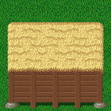
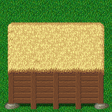
Posted: 14 Mar 2006, 00:50
by Crush
i am posting this picture uncommented.

i think i know what the issues are, but i would like to hear it from someone else.


