Posted: 15 Jan 2008, 23:08
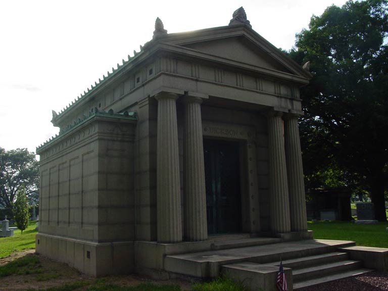
Also go wild with the shapes for once like you did with one of your gravestones. You are quite limited by the grid.
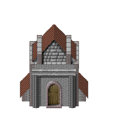
The modularity of the crypt is nice.
The modularity of the crypt is nice.
Feel the mana power growing inside you!
https://forums.themanaworld.org/
something like this?Crush wrote:How about mixing a bit of blue into your gray? Would look more interesting.

Crush wrote:I don't really see a difference.


I think I found better picture to describe what i want...Crush wrote:More like that:
http://img217.imageshack.us/img217/6353 ... ac0dq8.png
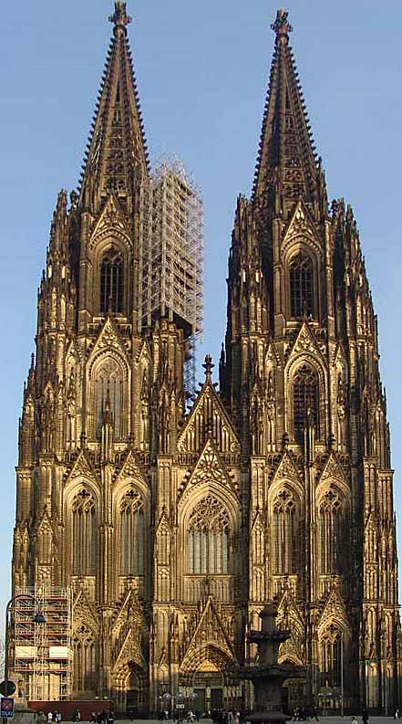
Regarding shape and detail: I would suggest you to use some gothic architecture as a reference. It has a quite creepy, intimidating feel to it:
http://upload.wikimedia.org/wikipedia/c ... er_Dom.jpg


Thats one sexy doori wrote:Maybe this piece of door could be useful:
Actually, I don't think so. It could be nice to add some improvements, especially in top part, and in darken area on left side of door. Anyway if someone want to adapt them for other purpose, feel free.Len wrote:Thats one sexy doori wrote:Maybe this piece of door could be useful:

you're free to edit it anytime...Len wrote:back on topic, if you look at the door you can see that the color range varies somewhat. This is something that the Crypt lacks...
definitely better than mine concepti wrote:so maybe something like should be more adequate?
