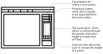
I've made some more modifications to the GUI.

You can view a larger image here: http://www.g3s.com/tmw/v4_Gui_Large.jpg
Anyway, I still have lots of work to do on this but it is coming along.
What do you guys (and gals) think?
This forum houses many years of development, tracing back to some of the earliest posts that exist on the board.
Its current use is for the continued development of the server and game it has always served: TMW Classic.


 TMW Italian community