Page 2 of 4
Re: TMW GUI - skinning thread
Posted: 12 Jul 2009, 12:43
by adamaix
Finally, after a whole night of skinning I'm proud to present this theme. Please test it


Re: TMW GUI - skinning thread
Posted: 12 Jul 2009, 12:52
by Inkweaver
Beautiful! I like it.
Re: TMW GUI - skinning thread
Posted: 12 Jul 2009, 13:26
by Crush
That skin is awesome! I could even imagine to have it as the official skin.
Re: TMW GUI - skinning thread
Posted: 12 Jul 2009, 13:30
by Jumpy
when do we have it as a choice in menu set up ?
great ! ! !
Regards
and chapeau bas !
Re: TMW GUI - skinning thread
Posted: 12 Jul 2009, 14:46
by adamaix
Thanks for all the compliments
I've discovered the first bug, when my HP hits about a third then the color becomes almost indistinguishable from the background. Rather replace my vscroll_grey.png with Irukard's, it's much nicer too.
Mine:


Irukard's:


I have also added a drop shadow under the main window border, I would like to do this with alpha transparency but then, unfortunately, gui opacity wont work correctly using software rendering (thanks Freeyorp). If there is a workaround to this, please let me know.

- window with drop shadow
- window.png (22.6 KiB) Viewed 3444 times
 gui.xml
- replace with this gui.xml to enable dropshadows
- (864 Bytes) Downloaded 73 times
Re: TMW GUI - skinning thread
Posted: 12 Jul 2009, 16:20
by adamaix
Scroll bars are now more inline with the theme set.

- scroll bars
- TMW_scroll.jpg (116.47 KiB) Viewed 3437 times
here is release 0.2, please download and test.
Re: TMW GUI - skinning thread
Posted: 13 Jul 2009, 15:49
by Matt
Looks nice, but your tab buttons suck, the text on the top is hard to read if it gets on the border and irus bars are better.
everthing else - great work!
Re: TMW GUI - skinning thread
Posted: 13 Jul 2009, 18:39
by adamaix
Matt wrote:Looks nice, but your tab buttons suck, the text on the top is hard to read if it gets on the border and irus bars are better.
everthing else - great work!
[Tab buttons] It probably does, but it looks fine to me. The buttons were the hardest to do, and I made the tab's in the same style. I might want to redo the buttons in a different style, if you think of a better style, let me know (mossy stone's anyone?)
[Text on top is hard to read] - It's readable to me, but not how I would like it. I have spoken to the developers to improve skinning support for Title Bars, meanwhile Freeyorp submitted a
patch to globally increase the window padding to a value specified in gui.xml which fixes the problem somewhat.
Aside from that, the jagged edges on the border is almost critical to get the bg_quad to suitably blend into the outlining wooden border, and I would most likely keep the theme in line with the official splash theme, though I am working on an experimental border utilising transparency effects, we'll see how that pans out.
[irus bars] Yes they are

Thats why I've reused almost most of what he has done, 1) vscroll_grey.png 2) slider.png 3) checkbox.png
[everthing else - great work!] thanks!
edit: I've worked on a mossy stone button, is it better than the wooden set? Should I highlight the moss a little more?
- mossy stone buttons
- stonebuttons.png (121.15 KiB) Viewed 3327 times

- TMW_Screenshot_17.png (26.97 KiB) Viewed 3321 times
Re: TMW GUI - skinning thread
Posted: 13 Jul 2009, 19:47
by Beelzebub
I really like this look and just had to add my kudos into this thread. Great Work!
Re: TMW GUI - skinning thread
Posted: 14 Jul 2009, 04:03
by Len
TMW continues to be indebted to Daniel Cook
Re: TMW GUI - skinning thread
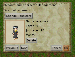
Posted: 18 Jul 2009, 05:33
by adamaix
Re: TMW GUI - skinning thread
Posted: 20 Jul 2009, 19:33
by Rotonen
Please leave the chat window and all popups transparent.
Re: TMW GUI - skinning thread
Posted: 20 Jul 2009, 19:54
by Jaxad0127
This theme will be the default for the next release.
Rotonen wrote:Please leave the chat window and all popups transparent.
Per window transparency isn't possible at the moment. It would be easy to add, but would make setup more complicated.
Re: TMW GUI - skinning thread
Posted: 20 Jul 2009, 20:16
by Matt
I like the new gray buttons - but the window background sucks now - too green.
Re: TMW GUI - skinning thread
Posted: 31 Jul 2009, 18:36
by adamaix
I did a button inspired by Wesnoth. Its not perfect yet, but I would like to know what the community thinks. Should I continue this? Perhaps another color?