
Well yeah, naturally this would be better suited to either a long-range polearm or a short-range attack like a knife, whereas the larger blur is more suited to larger weapons like a sword.Modanung wrote:This blur is against the reason I made the attack frames the way they are. The whole idea was that the weapon passes through the entire area of attack.Pauan wrote:My friend Curly created a better blur. Here it is:

Also I now see some changes in the legs which make the character's movement look odd. His legs became quite stiff and slide over the ground.
I agree with Cosmotrator's point though; the back leg should stay put, not the front one. I'll look into it, but first I need some sleep.
New playerset's frames and animation
Fine then. But if the sword is going to be used in this manner, then it's name should be changed, because it is no longer a Falchion. Same goes for it's misspelling, "Falcion."Pauan wrote:Crush wrote:P.S. That is true. But for a different reason than you listed. Even fantasies have a basis in reality. However, your "rule of cool" still applies. This is a videogame, and as such the only thing that matters is the player. If the player thinks this game is cool and fun, then we have succeeded. But if the player thinks it's lame or boring, we have failed. That is our goal. A master swordsmith can argue all day about the integrity of the blade and how ineffecient it is, but the player honestly doesn't know or care. If a player saw that blade, they would logically think the pointy end is in front. After all, doesn't it resemble a miniature scythe? Thinking of it from a player's perspective, it makes perfect sense. The small hook could be used to slice somebody's head off, for instance. Sure it may not make sense in the real world, but it makes perfect sense to the player, who ultimately is all that matters to a game developer. Realism only becomes a factor if it affects the fun that the player will have.
I'm a proud member of the Online Campaign for Real English, a movement for those who believe in capital letters, correct spelling, and good sentence structure.


Well that's kinda the point.. a sword isn't a long-range weapon, but it's moderately fast and powerful.AxlTrozz wrote:Considering the size of the actual monsters I think that's a good movement, If we create a big monster or boss I don't think an attack like that it would be useful
...Unless you were referring to the way the sword is held, in which case that was my mistake.
...Or if you were referring to the blur made by Curly, then yeah, like I said it'd be better suited to smaller things like knives.
Actually, it's spelled correctly.Falcata wrote:]Fine then. But if the sword is going to be used in this manner, then it's name should be changed, because it is no longer a Falchion. Same goes for it's misspelling, "Falcion."
Anyways! I shifted around the frames a bit so that the back foot doesn't move anymore. Certainly more tweaks are needed, but tell me what you think anyways. Oh and the first blur is back by popular demand...!


Powerful! Looks so much better now the back foot stays put 
Turns out you needn't have put me on the mantis after all
One thing I did like about the other slash was that it used an extra frame at the end to disappear. I think that made the slice look kind of more... decisive? Or rather, I think it's that this one looks a bit weird just disappearing all at once, being so big 'n' all.
It's also nice 'cause an extra frame or two of disappearing blur wouldn't be too much hassle for weapon spriters, and makes it look cooler without making equipment spriters require any more frames
We'll burn that bridge when we come to it.Doubi wrote:Powerful! Looks so much better now the back foot stays put
Turns out you needn't have put me on the mantis after all
One thing I did like about the other slash was that it used an extra frame at the end to disappear. I think that made the slice look kind of more... decisive? Or rather, I think it's that this one looks a bit weird just disappearing all at once, being so big 'n' all.
It's also nice 'cause an extra frame or two of disappearing blur wouldn't be too much hassle for weapon spriters, and makes it look cooler without making equipment spriters require any more frames
-
Cosmostrator

- Novice

- Posts: 132
- Joined: 23 Aug 2006, 06:13
- Location: USA - So. Cal

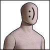
It is not bad. But there can be many improvements. For example, in the 2nd and 3rd frames, the legs are spread too far apart (the rule of thumb is 2 feets apart and shouldn't be wider than the shoulder), and head is just weird. Maybe it is too stationary, or maybe the body's movement is too exaggerated, but as it is, it doesn't look very natural.Pauan wrote:Actually, it's spelled correctly.Falcata wrote:]Fine then. But if the sword is going to be used in this manner, then it's name should be changed, because it is no longer a Falchion. Same goes for it's misspelling, "Falcion."
Anyways! I shifted around the frames a bit so that the back foot doesn't move anymore. Certainly more tweaks are needed, but tell me what you think anyways. Oh and the first blur is back by popular demand...!
-
Modanung
- Grand Knight

- Posts: 1719
- Joined: 20 May 2005, 15:51
- Location: Groningen, The Netherlands
- Contact:
The thing with the head is that if you make it turn during the animation you need extra frames for hats/helmets/hair as well.Saphy wrote:...and head is just weird. Maybe it is too stationary, or maybe the body's movement is too exaggerated, but as it is, it doesn't look very natural.
If you're looking for 3D FOSS games be sure to check out LucKey Productions on itch.io
Modanung's totally spot on about the extra headgear frames. Though the rigidness of the head's direction is noticeable, I'm not sure that it looks bad enough to justify the extra equipment frames. Besides, I could imagine a moderately well-equipped character muffling that rigidness a bit. The equipment they're clad in might help to take a bit of focus off of some of the more exaggerated motions.
..I prefer Curly's blur. The other one looks ... hairy?
..I prefer Curly's blur. The other one looks ... hairy?
-
ElvenProgrammer

- Founder

- Posts: 2526
- Joined: 13 Apr 2004, 19:11
- Location: Italy
- Contact:
 TMW Italian community
Re: New playerset's frames and animation
Its not the head that look weird. I think it does not work quite right because the body mass changes to much when the shoulders turn. He looks like he dropped 50 lbs from the standing position.
"Too much of a good thing is an awesome thing, but too much of an awesome thing is, um, really really dumb. And bad." Strong Bad

Re: New playerset's frames and animation
I have a feeling this sprite is getting longer while animating...
Regards.
Regards.


Re:
We should be able to achieve the desired effect with facial expressions (especially the eyes should play into this). Kind of hard without making more work for headgear, though. Of course, as always, I don't personally have nothing against more work for equipment. Unless someone can provide a solution which does not cause that and also works, we're going to have to do it anyway.dabe wrote:Modanung's totally spot on about the extra headgear frames. Though the rigidness of the head's direction is noticeable, I'm not sure that it looks bad enough to justify the extra equipment frames. Besides, I could imagine a moderately well-equipped character muffling that rigidness a bit. The equipment they're clad in might help to take a bit of focus off of some of the more exaggerated motions.
This message used to be meaningful.