
Now that you mention it, I believe you are correct. Someone could adjust this picture so it could use the 2 colors with the xml color codes. This would enable us to create various types of bowler hat with dyeable bands. We'll stick with the single bowler hat we have now and if more work is done, adjust as we can to get this established.Reid wrote:Just as information, maybe crush didn't said it, you can put 2 dyable color in a item, so no need to do the sprite 3 time
[GIT] Bowler Hat
Re: [FND] Bowler Hat
Current character is "Abolish".
-
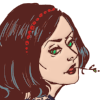
ChefChelios

- Novice

- Posts: 210
- Joined: 27 Jul 2010, 05:54
- Location: ...schlaaaand!!
Re: [GIT] Bowler Hat
Reid wrote:you can put 2 dyable color in a item
what do we need to have two dyable colors at one item?Wombat wrote:Someone could adjust this picture so it could use the 2 colors
a grayscaled hat or each part of it as a singel png?
- Attachments
-
- grayscaled
- bowler-hat.png (1.42 KiB) Viewed 2308 times
-
- bowler-hat-whitout-band.png (1.25 KiB) Viewed 2308 times
-
- bowler-hat-band.png (467 Bytes) Viewed 2308 times
...und lachend stellte der Tod seine Sense beiseite und stieg auf den Mähdrescher, denn es war Krieg.


Re: [GIT] Bowler Hat
Always..Now that you mention it, I believe you are correct.
@Chef :No.
Something like that :
- chef's hat.png (1.51 KiB) Viewed 2304 times
and the xml to show you how it work :
<imageset name="base" src="graphics/sprites/x/x/x.png|W;R" width="a" height="b" />
I hope it will help you ..
Edit : I did that rapidly... It's bad, but it's only to show you
"Time is an illusion. Lunchtime doubly so."
-- Ford Prefect
-- Ford Prefect


Re: [GIT] Bowler Hat
Let me elaborate a bit on what Reid did here.Reid wrote: Something like that : 2 dyable color on it.
While the pure grey colors are the most commonly used dyeable colors, there are also others which can be dyed independently. You can also dye the pure red, green, blue, yellow, cyan and magenta color ramps. A color is considered "pure" when the saturation is 100% and the hue is dividable by 60 or, in RGB terms, all 3 channels have either 0 or equal intensity.
There is an article about the image dyeing system on the wiki which explains it in greater detail. Anyone who wants to do graphics for TMW seriously should have read it.
- former Manasource Programmer
- former TMW Pixel artist
- NOT a game master
Please do not send me any inquiries regarding player accounts on TMW.
You might have heard a certain rumor about me. This rumor is completely false. You might also have heard the other rumor about me. This rumor is 100% accurate.

Re: [GIT] Bowler Hat
Doing a clear TODO list of "please read these first" for new people would not hurt the project either.
There is a joining the project article on the wiki which might need a bit of brushing up to help people and the project.
There is a joining the project article on the wiki which might need a bit of brushing up to help people and the project.
This message used to be meaningful.
Re: [GIT] Bowler Hat
Hello all, I was thinking if it was possible to make the band more lighter on the hat because people complain it is too dark. For example, when you look at dark green, it is nearly the same color as the hat... -> needs to be fixed quickly (cause it is easy) IMO.
Do you see any good thing here? It looks ugly for the players. A bright band will fix this!
Moreover a fix will be nice on the icon too. Let's look at the black bowler hat.
The A red line shows that this end is a bit too sharp and steep, maybe antialisaing?
The other red lines show pixels that are too bright, normally they should be colored with the color black but just a bit. Here it makes bright blue pixels near the deep black bend.
Last thing: may I propose other adjectives for the description of the colored bowler hats. We have 3 times :
"A wizard hat, bright [color]." This is why i would like someone to change the 2 of the descriptions of the red, orange or pink.
Regards.
- Armor-head-darkgreenbowlerhat.png (1.04 KiB) Viewed 2216 times
Moreover a fix will be nice on the icon too. Let's look at the black bowler hat.
- Armor-head-blackbowlerhat.png (4.32 KiB) Viewed 2217 times
The other red lines show pixels that are too bright, normally they should be colored with the color black but just a bit. Here it makes bright blue pixels near the deep black bend.
Last thing: may I propose other adjectives for the description of the colored bowler hats. We have 3 times :
"A wizard hat, bright [color]." This is why i would like someone to change the 2 of the descriptions of the red, orange or pink.
Regards.


Re: [GIT] Bowler Hat
""Do you see any good thing here?"" um yes,yes i do ....i see a well made hat ..Ali-G wrote:Hello all, I was thinking if it was possible to make the band more lighter on the hat because people complain it is too dark. For example, when you look at dark green, it is nearly the same color as the hat... -> needs to be fixed quickly (cause it is easy) IMO. Do you see any good thing here? It looks ugly for the players. A bright band will fix this!
Moreover a fix will be nice on the icon too. Let's look at the black bowler hat. The A red line shows that this end is a bit too sharp and steep, maybe antialisaing?
The other red lines show pixels that are too bright, normally they should be colored with the color black but just a bit. Here it makes bright blue pixels near the deep black bend.
Last thing: may I propose other adjectives for the description of the colored bowler hats. We have 3 times :
"A wizard hat, bright [color]." This is why i would like someone to change the 2 of the descriptions of the red, orange or pink.
Regards.
""color black"" black is not a color....really its true ,its a tone.........its good to use black as little as possible or not at all..
"" bit too sharp and steep"" as far as i can see its one of the best perspective hats in game ...
""The other red lines show pixels that are too bright"" the pixels you point at are imo needed ,if you look close at other things like it in color (like the toy-bat) you will find the same..using color like that helps show depth ....if it was not there it would look flat and blend even more with the band.....
IMO- it would be cool to see a re-do of the tophat to fit the perspective of the bowler...
--skipy
back to working on---> (crypt)then(player 1.5) and more. *been on hold do to my laptop being fix* any feel free to add/help. ill be up and working as soon as i can ...good luck to all.
"A mulatto, an albino
A mosquito, my libido
Yeah, hey, yay"---Nirvana
"A mulatto, an albino
A mosquito, my libido
Yeah, hey, yay"---Nirvana
[re]bowler hat
Ali-G wrote: Do you see any good thing here?

So far you have only made one point. Originally the color of the hat was to dark.
This new image you present us with, you edited the shading. If you look at it you will notice that instead of its nice round shape that it was originally posted with, it now has a flat spot. You should learn how to shade round objects.
The band on a bowler hat is hardy every noticeable. Yes if it is a different color its going to be noticeable. Not brighter. If it is made out of silk than it will have more shine. I do suggest adding a shine to the hats band.
@chef very nice job on that hat and especially the gloves. I hope you continue with them there flawless IMO. As a side note watch how many colors you use. 6 shades in an object is usually hardly necessary when it only consist of one color. Also it could use less contrast and more saturation.
Re: [GIT] Bowler Hat
Then let it stay like this or make it brighter (the band or the hat...). I was just giving my opinion...
Regards.
Regards.
Re: [GIT] Bowler Hat
It needs highlights not brightness.