Page 5 of 6
Posted: 09 Nov 2006, 00:25
by Crush
here a (not very realistic) mockup of the stairs with rails:

Posted: 09 Nov 2006, 01:28
by Modanung
Nice.
I hope you will make the railing connect better to the floor/wall. Apart from that it looks good.
Posted: 09 Nov 2006, 08:18
by ElvenProgrammer
Very nice. What bothers me it's when the first floor comes in contact with the base floor. Anyway I think this impression will change when one create a more elaborate map with building walls and stuff. Good work.
Posted: 09 Nov 2006, 17:37
by D2ARCHER
excelent...
Posted: 09 Nov 2006, 17:51
by yosuhara
me like

Posted: 26 Nov 2006, 03:13
by Crush
I redid the fireplace:

Posted: 26 Nov 2006, 10:19
by Matt
Nice improvement

Posted: 26 Nov 2006, 13:03
by Modanung
Looks good, I think the darkest colour should be darker though.
Posted: 13 Dec 2006, 14:05
by Crush
here two new things.
Carpenters workbench:

Sword presentation at weapon shop:

Posted: 13 Dec 2006, 16:36
by yosuhara
Crush wrote:here two new things.
Carpenters workbench:
Sword presentation at weapon shop:
that workbench is very nice... but what bugs me are the swords..Though they seems sturdy, they have wooden handle(?), also first and second sword from the left are maybe too massive (broad) and imho their handles should be metallic and bigger
Posted: 13 Dec 2006, 22:16
by Crush
Walls with open and closed doors:

Posted: 14 Dec 2006, 08:22
by Dr Wahl
would it be possible to have rooms with locked doors, and only if the player has the correct key (maybe aquired from a quest?) they could get into the room? that would be a great use for closed doors!
Posted: 14 Dec 2006, 10:36
by i
Crush wrote:Walls with open and closed doors:
i dont like it. it looks too plain. try to use some gradients. also imo u should add some shadows and highlights. maybe something like that:
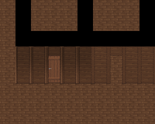
there is still something wrong with vertical highlight, but that was only quick preview. shadows in place where wall meets floor are necessary to separate them. That kind of trick broke linear placement of planes, adding illusion of 3d.
try to look at walls in in tileset. Jetryl told me to do that, and since that moment it started looks fine.
you could also invert gradient - add black part on bottom and light on top. it radicaly change climate of rooms
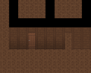
maybe, other example:
Posted: 14 Dec 2006, 13:39
by Modanung
Yay for iru, although his examples are a bit too much... blending the original with either one of his examples would be a great improvement.
Posted: 14 Dec 2006, 14:34
by Crush
As i said before i will experiment with gradients after everything else is finished. The reason is that using unclean tools make it much harder to edit the tiles.
But when i do i will most certainly go for the 2nd version. The light from below looks quite unnatural to me.