Page 1 of 2
[DIS] New logo
Posted: 27 Aug 2016, 15:40
by WildX
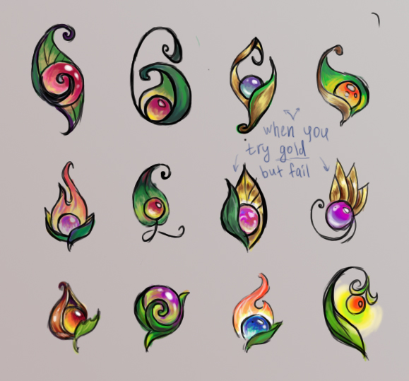
Evol was in the process of developing a new logo. I would like to propose to continue its development here, as this logo is also a perfect representation of the Mana Seed, upon which much of the game's lore will be centred.
These are the designs authored and proposed by Kansu. I find them all amazing tbh. We need to find one and polish it.
For the nostalgic lot, I will also ensure that the current TMW logo survives as the sigil of one of the game's guilds (lore guilds, not players').
Re: [DIS] New logo
Posted: 15 Sep 2016, 20:38
by tomminator
i like most of the designs, but i think i like the second from left on the bottom row best.
The first and the last are also very nice
Re: [DIS] New logo
Posted: 20 Sep 2016, 19:06
by wushin
the first or the last are my favorites, but they all look good enough.
Re: [DIS] New logo
Posted: 21 Sep 2016, 00:02
by omatt
(Can you edit the image and put a number beside every logo ?)
I like the third of last line, like the mana burning for eternity :3
Re: [DIS] New logo
Posted: 22 Sep 2016, 08:30
by skozlojops
Third on last line are nice.
Re: [DIS] New logo
Posted: 08 Jan 2017, 17:42
by Tirifto
Hello to all.
Reid wrote:...we have to first know what we want, what style, what it should represent
In reaction to that quote
(taken from IRC, #evol-dev), I'd like to say that in my opinion, the logo should mostly look cool and make the player feel excited and want to click it when they see the icon on their launcher, taksbar, or worse, desktop.
WildX has suggested that the logo should present the mana seed because it's a main plot element. I think the mana seed is a great thing that's fairly unique; I have not seen the concept of a mana seed elsewhere. The prototypes all look very nice, too.
Do we know what
is the mana seed? Where does it come from, what is its purpose, its abilities, what does it feel like, if we can eat it? Because the prototypes all vary in looks, it feels like the definition of the mana seed is somewhat vague; but the more we know about it, the more specific elements we can decide to be part of the seed (and the logo) and the more elements we have to work with and implement in creative ways in the logo.
In all the prototypes and in the current mana seed sprites in the game (TMW Legacy) we can see a small ball. It appears to be smooth and shiny. If that's the case, we can easily port over the old (current) logo to it. We have a smooth and shiny ball in our old logo, with a reflection of the Mana globe. We can easily add the same reflection to the seed, thus getting both "mana (seed)" and "(mana) world" represented in the logo.
The prototypes also feature some sort of a leaf shell. That also could be tuned for creative branding. I did some sketches (by hand, because my software is out of service) to illustrate.
The prototype shown above forms the leaves into a shape that can carry several meanings related to the game. See below.
Also keep in mind that we are never limited to choosing from what is presented to us. We can take and reuse ideas, add our own to them and combine existing things to create new (and maybe even better) ones. See below an example of two of the prototypes combined.
Finally, the logo should be made so that it can be presented in big sizes with many details just as well as in small sizes with only basic symbolic elements. That, however, shouldn't be a problem to do easily with most logos, from my experience.
Re: [DIS] New logo
Posted: 08 Jan 2017, 17:51
by Reid
I won't comment for now on the big talk, I want to see some other people's opinions first.
Just one point related to the final sentence:
Tirifto wrote:Finally, the logo should be made so that it can be presented in big sizes with many details just as well as in small sizes with only basic symbolic elements. That, however, shouldn't be a problem to do easily with most logos, from my experience.
We can use the mana seed itself as the logo for small resolutions.
Re: [DIS] New logo
Posted: 08 Jan 2017, 17:59
by WildX
In relation to what the seed actually is: nobody really knows what it is. It looks like a greenish/blueish glossy sphere the size of an apple. Since Mana is life and every living thing has Mana, it is thought to be pure concentrated Mana with the ability to grow into a Mana Tree which is a living thing on the edge between Mana energy and living biomass.
Re: [DIS] New logo
Posted: 08 Jan 2017, 18:19
by Saulc
In a logo spirit for me the best its the second of last line coz its the most compact

Regards
Re: [DIS] New logo
Posted: 12 Mar 2018, 18:38
by WildX
I've made a few changes to one of Kansu's logos. It's a lazy edit with a lot of blur tool, just to get a better idea of the logo I'd like to see.
The main thing I did was change the colour of the mana seed.

- WX_Logo1.png (13.93 KiB) Viewed 8362 times
I think a bit of pixel work could get us a decent-looking logo. I tried to vectorize it but that also needs a better base to start from or the colours will be messed up. A vector would be ideal for the final product.
Re: [DIS] New logo
Posted: 18 Mar 2018, 11:03
by Alige
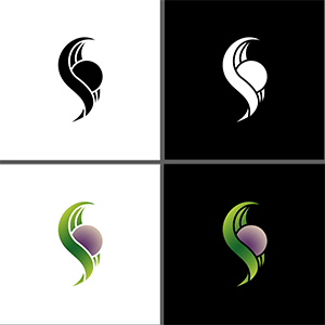
Quick vectorial tries of a possible new logo.

- Test 1.png (6.46 KiB) Viewed 8326 times

- Test 2.png (6.58 KiB) Viewed 8326 times
Re: [DIS] New logo
Posted: 18 Mar 2018, 16:19
by WildX
Just the person I would have wanted for this job!
I like both versions, but the first one might be better with the flame element added to it. The second could work as it is, but then I would change the purple colour to something more vibrant.
You may have outdone The Mana Weed

Re: [DIS] New logo
Posted: 18 Mar 2018, 22:06
by gumi
Alige, do you have a .svg anywhere for those logos?
They look very neat BTW
Re: [DIS] New logo
Posted: 19 Mar 2018, 16:32
by Micksha
Hey,
inspired by Alige's nice logos I tried something too, using a path made from the original one:
Re: [DIS] New logo
Posted: 19 Mar 2018, 16:41
by WildX
I like the flame but after seeing Alige's first one I prefer that part rather than the original style


