Page 1 of 11
[FND] Block Walls (City walls, Prison, Arena)
Posted: 02 Nov 2006, 13:06
by i
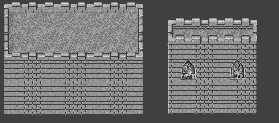
tmw concrete walls 0.0.6

Posted: 02 Nov 2006, 14:19
by Crush
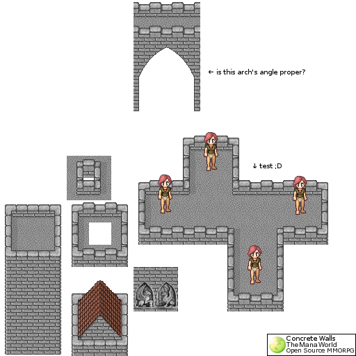
as i already said on irc: the statues are absolutely brilliant.
but the shading of the bricks is wrong. the highlights should be in the upper right corner and not the lower right. I'll make a fixed version of the basic wall tile.
Edit:

Posted: 02 Nov 2006, 14:20
by Modanung
Looks nice.
I like the statues, I don't think they fit in though. They're very smooth, look more like resized images. Did you draw those?
Another thing about the gate... the arc looks odd. This is the way you build an arch:
 (Click to enlarge)
About the capsule-shaped part. The right bend has highlights it should not have, as you know the light comes from the southeast.
Nevertheless good work.
Posted: 02 Nov 2006, 14:59
by Matt
Nov 01 16:19:16 Crush__ how did you made that sculptures? they just look great.
Nov 01 16:20:31 irukard i got pictures of reliefs in book ;D
Nov 01 16:20:43 Crush__ scanned and resized them?
Nov 01 16:20:46 irukard i scan it and repixel, in proper perspective ;D
Nov 01 16:21:18 irukard nope they were in diferent perspective. from bottom
Nov 01 16:21:27 Crush__ good job
Nov 01 16:21:56 m[a]tt <3 irukard
Posted: 02 Nov 2006, 17:02
by BadMrBox
Everything I was about to say has been said, the arc looks strange, wrong light and the statues look smashing

. Thought I'm pretty sure that the griffin's are in a slightly wrong angle aren't they?
Posted: 04 Nov 2006, 00:47
by i
Arch will be redrawn...
Posted: 04 Nov 2006, 01:38
by Tarm
Bigger windows for the gargoyles to "nest" in!
It looks ridiculous crowded.
Posted: 04 Nov 2006, 09:20
by i
Tarm wrote:Bigger windows for the gargoyles to "nest" in!
It looks ridiculous crowded.
Tarm with all respect, but those are reliefs not sculptures.

Posted: 04 Nov 2006, 16:31
by Tarm
Alright now Im feeling stupid.

Posted: 05 Nov 2006, 04:24
by Rotonen
You might want to rethink the inner edges of the arch since now it looks like a texturized cardboard prop into which a hole has been cut.
Posted: 05 Nov 2006, 12:26
by yosuhara
Rotonen wrote:You might want to rethink the inner edges of the arch since now it looks like a texturized cardboard prop into which a hole has been cut.
i think iru just want to make sure about the angle, i assume the arch isn't finished
Posted: 05 Nov 2006, 14:51
by Quiche_on_a_leash
I think that the arch still needs some work.
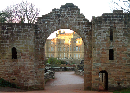
It doesn't look very substantial, it would look better if the arch had stones like the image in Modanungs post and the below link IMO.
http://www.sujo.com/Prints/Castle%20thr ... 301201.jpg
Posted: 05 Nov 2006, 18:49
by i
well acctually, i draw only arch's devel, not arch. i want to ensure that arch's angle is proper.
Posted: 05 Nov 2006, 21:04
by Modanung
Maybe the arc should be vertical at the ends instead of sloped. To make the transition from arc to straight more smooth. If you know what I mean.
Posted: 06 Nov 2006, 08:11
by i
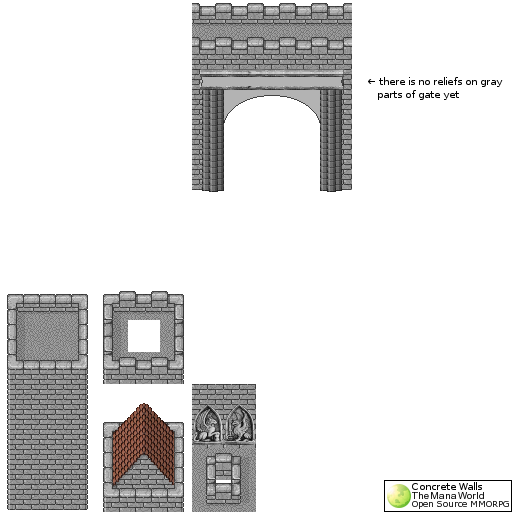
I decided to change arch shape to more rounded.
Arch's columns IMO are a bit to dark (will be improved in next version), also gray parts of things above arch are unfinished. They are without bas-reliefs and there is no shading there. Also whole construction need to be polished.
