Page 2 of 7
Posted: 04 Dec 2006, 03:52
by Rotonen
Just to make it clear, the differences between different similar items can be subtle and there can be recolorations of the same item. (Allowing recoloration where it makes sense: different colors of clothing and such.)
In this case making a golden chainmail wouldn't just make any sense at all to me, but making a chainmail out of a lighter, yet durable metal would. The "no recoloration policy" is mostly about monster design and in some cases weaponry too.
Posted: 04 Dec 2006, 18:22
by The Judge
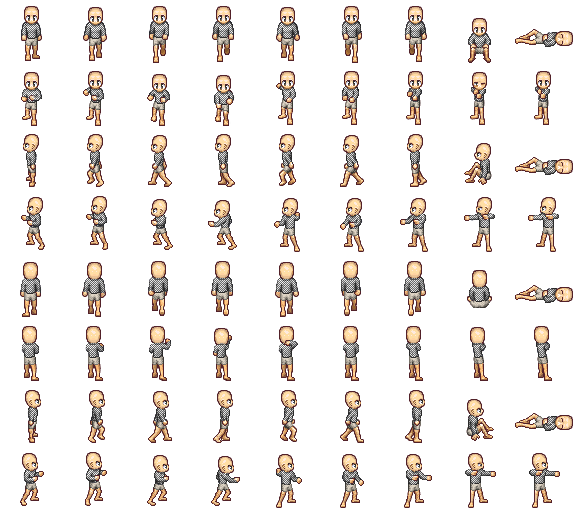
Ok, so heres the final male version, unless anybody wants to tweak it further, feel free.
<img src="
http://i126.photobucket.com/albums/p117 ... 187"></img>
And here's it on a character:
<img src="
http://i126.photobucket.com/albums/p117 ... 268"></img>
I'm pretty happy with those. Here's my attempt at the female version...I think I should work on the grayscale and contrast levels a little more, but what do you all think?
<img src="
http://i126.photobucket.com/albums/p117 ... 461"></img>
Alright thats it. thx.
Posted: 04 Dec 2006, 18:42
by mangamaniac
I think, there should be more shading under the boobs of female version.
Posted: 04 Dec 2006, 18:46
by Modanung
mangamaniac wrote:I think, there should be more shading under the boobs of female version.
Agreed, lack of depth in all four directions.
Posted: 04 Dec 2006, 18:48
by The Judge
More shading. Check. Will have it up tonight or tomorrow probably.
Posted: 04 Dec 2006, 19:03
by Crush
When you do so it would be nice when you would upload it to the wiki and replace this file:
http://wiki.themanaworld.org/index.php/ ... female.png
to make sure that this article:
http://wiki.themanaworld.org/index.php/ ... evelopment
is up to date.
Thank you.
Posted: 04 Dec 2006, 20:19
by Crush
Rotonen wrote:In this case making a golden chainmail wouldn't just make any sense at all to me, but making a chainmail out of a lighter, yet durable metal would. The "no recoloration policy" is mostly about monster design and in some cases weaponry too.
Of course a golden armor wouldn't have been that useful on the battlefields of the middle age. But we are doing a fantasy world. Gold might have some mystical propertys that make it useful in combat. It could for example shield you from certain types of magic or status ailments. That would make it a reasonable choice as an armor for people who can afford it. And for aristocrats looking representable might be more important than efficience in combat. A very rich warlord might wear a gilded chainmail just for showing off.
Could look like that:

Posted: 04 Dec 2006, 22:49
by The Judge
Ok, I tried some stuff on the first row of female chainmail shirts. Am I getting close?
<img src="
http://i126.photobucket.com/albums/p117 ... 511"></img>
Posted: 04 Dec 2006, 22:59
by Crush
in addition to making the lower part darker you should also make the upper part brighter.
As an example the male and the female cotton shirt:

Posted: 04 Dec 2006, 23:25
by Crush
About the male chainmail again: I used a bit GIMP magic to make the dithering brighter in the bright parts. I think it looks better because the dithering works less against the shading:

Don't worry how i made it - i can do the same with the female version.
Posted: 04 Dec 2006, 23:33
by The Judge
<img src="
http://i126.photobucket.com/albums/p117 ... 104"></img>
Like this? Maybe?
And in regards to the male mail changes, I think the final I have up on top looks better, but your call. Your the dev. If you want to dither it and the female version when I get that done, well, as long as you think it looks better, fine by me.
Posted: 04 Dec 2006, 23:46
by Crush
It is normal to react intuitively negative on other peoples changes at your work. I got the same problem. Let's see what other people think about this.
About your new boobs: You drew your new shading over the dithering. When the shading doesn't affect the dithering anywhere else it shouldn't be affected by the shading of the breasts either. that looks quite strange. just don't touch the dithering at all.
and then you have the highlight left on the right breast and right on the left breast as if they would be lit by a light bulp under her chin. it would look much better when both breasts would be lit from the same direction (from left because the rest of the sprite is lit from the left). just take the cotton shirt posted above as a reference.
Posted: 05 Dec 2006, 01:10
by The Judge
Ok...am I getting any closer? I'm not entirely sure what dithering is...so I hope I didn't mess with it. I took it to mean don't mess with the dark colored pixels that were patterned all over the chainmail. And I didn't, except in areas of shadow, where they would be darker. Hence, I wasn't too sure about the highlighting above, but I think these boobs look more realistic...at least as more as they can being made of so few pixels.

<img src="
http://i126.photobucket.com/albums/p117 ... 753"></img>
Posted: 05 Dec 2006, 01:39
by Crush
yes, the black checkboard pattern is called "dithering". you understood it correctly. it looks quite fine now. Although the boobs seem to be in different heights on some of the sprites you posted.
Posted: 05 Dec 2006, 02:38
by The Judge
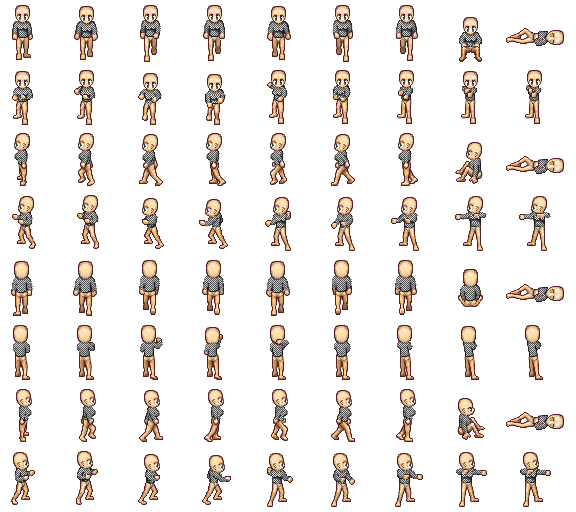
Sweeeeeeet. K here's the female final versions. I hope final versions.
<img src="
http://i126.photobucket.com/albums/p117 ... 159"></img>
and on a model:
<img src="
http://i126.photobucket.com/albums/p117 ... 206"></img>
The male finals are earlier in here of course. I'll keep an open mind to any changes you all want to make, but here they be.