Page 1 of 2
6.8's Art Dump
Posted: 13 Jan 2007, 08:24
by Amethyst
I sort of stole this idea, but I'm going to put pixel art I make in this topic, could you guys rate it and tell me what I need to fix?
I made this after an Easter Island head, it could be used for a beach area or a deep forest village ruin.

Posted: 13 Jan 2007, 10:26
by i
1. wrong perspective,
2. improper shadows and shadings,
3. don't use use black outline,
4. don't ask silly questions - just look at pixelart tutorials
5. It supposedly should be bigger that human body
Posted: 13 Jan 2007, 11:09
by Rotonen
6. Try to avoid directly copying things that exist in this world.
Posted: 13 Jan 2007, 12:06
by i
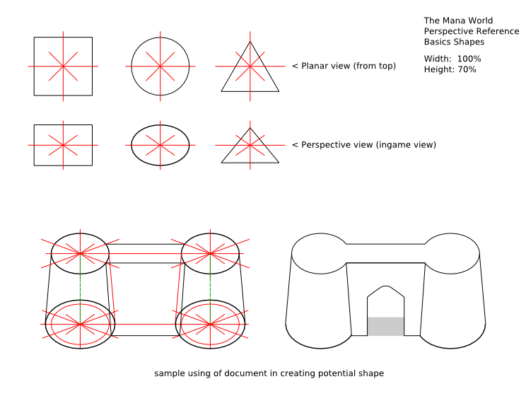
Perspective reference for point one:
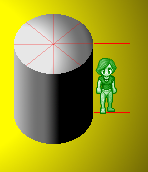
Base of that figure is of course circle.
7. It is good to add some textures on low transparency layer on top of object - you could achieve incredible effects with that method.
Re: 6.8's Art Dump
Posted: 13 Jan 2007, 15:34
by Crush
sixpointnine wrote:
As irukard said this is not very good, yet. But don't worry, here i will show you how to fix it.
Problem 1: the perspective.
The head is shown from the front, but the perspective ingame in diagonal from a 45° angle. That means that the top has to be visible and the lower side and the lines you drew horizontal have to be curved.

Problem 2: The black lines.
Only beginners add detail by adding black lines. Good pixel artist don't draw carvings and reliefs with lines but with light and shadow. When you got edges toward the light source, you make them brighter and when you got edges away from the light source you make them darker.

Problem 3: The lightning
You put some highlights to the lower parts, although it would be correct to put them in the upper parts. I already corrected this at the face parts in the last step. Now i fix the base and the main part:

Problem 4: The linear shading
The shading looks too regular giving it the look as if it were made of plastic. To make it look more stone-like you should use a technique called "dithering". It means that you expand every shading zone by springling the neighboring color zones with random pixels of its color. More at the border and the further you get into the other color the less pixels you place. This doesn't only make the color transitions more smooth but also give the surface a rough expression:

Posted: 13 Jan 2007, 17:15
by Bjørn
Very nice examples. I know this must be rather annoying, but I can't help to add a final step, restoring the contrast of the original:

Posted: 13 Jan 2007, 23:10
by i
ok, it looks better but not good enogh to implement that in game
you changed perspective only on top and bottom. remember that face must be drawn in proper perspective too. also there is something wrong with overall style.
anyway it is nice to see that someone read ours hint and tries to put them in live. Word for today "Keep practicing, keep learning, keep analyzing arts of other people". You are on good path. ;D
Posted: 14 Jan 2007, 00:18
by i
I made that document to help everyone new in graphic developement.
If someone wishes I could share SVG (inkscape) file. I must say that designing variety of shapes is quite easy, of course with basic knowledge of inkscape and some of 3d creative imagination.
but
Posted: 14 Jan 2007, 07:32
by Manaboy
Posted: 31 May 2007, 08:09
by Platyna
I think Crush, you should report that guide with examples how to draw graphics for TMW so I could pin it.
Regards.
Posted: 31 May 2007, 19:42
by Amethyst
Well, I noticed the only thing in the forest are flowers and shrooms. I got this idea from Shrek, but how about this monster?

Posted: 31 May 2007, 19:46
by yosuhara
.enigmatik wrote:Well, I noticed the only thing in the forest are flowers and shrooms. I got this idea from Shrek, but how about this monster?
is it a living tree-stump?
Posted: 31 May 2007, 19:59
by Amethyst
Yeah.
Posted: 31 May 2007, 20:08
by Crush
Nice idea, but definitely with a lot of room for improvement.
Posted: 14 Jun 2007, 14:13
by Amethyst
Here is a ninja mask.

And what should be improved on the tree?

