Page 4 of 5
Posted: 28 Mar 2005, 18:33
by Blorx2
I like the second one. Is the next Mac version going to have the winning icon?
Posted: 28 Mar 2005, 18:58
by ElvenProgrammer
Probably we will have to wait until 0.0.12
Posted: 28 Mar 2005, 21:47
by Bjørn
Aacheron wrote:Catfish_Man wrote:I have to say I much prefer the original green/gold coloring.
Likewise; the ice-blue teal colour feels too cold; the world's supposed to be a generally "average" world, not an ice-world. I more like the warm glow of green on
this one.
I also share this opinion, the green/brown looks a lot nicer than the other three combinations.
I'm not sure about the internal drop shadows btw and maybe would prefer seams, to make the logo look more like a coin as the previous version did. I think this much dropshadow effects make it a bit incoherent.
Posted: 29 Mar 2005, 02:09
by Talaroc
I'm going to agree that the original green/brown looks the best of the lot. The brown in it does look a little odd, though; perhaps a bit less yellow to it, to give it a more wooden feel?
Posted: 30 Mar 2005, 11:16
by ElvenProgrammer
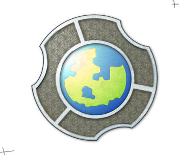
What about this one? Sincerely I like more the inner part completely green, but maybe someone could appreciate it this way

Posted: 30 Mar 2005, 11:17
by maci
ok you got it !
this is my absolute favourite now!
Hey Cool !
Posted: 30 Mar 2005, 11:26
by Bertram
Agreed ...
Posted: 30 Mar 2005, 14:57
by Rotonen
The globe image in the inner circle should be locked to that now. Perhaps the shading of the outer circle should be retouched in some way (again)..?
Posted: 30 Mar 2005, 15:06
by i
Elven. u got my vote

Someone else will chalange this logo?

I dont think so ^^
Posted: 30 Mar 2005, 22:51
by Bjørn
I like more the inner part to be completely green too, not so much this blue trend. Mixed with the previous version it could be like:

But I think I'd still prefer the totally green one.
Posted: 31 Mar 2005, 03:04
by Talaroc
I'm going to vote for the full-green globe, too. Looks more like a carved stone or something, which I like.
Posted: 31 Mar 2005, 05:28
by nym
/me installs inkscape so he can do his logo layout...
I think that the green land isn't the right shape


Posted: 31 Mar 2005, 06:22
by ElvenProgrammer
There's no need for inkscape! Gimp rulez, you made me know it, so now use it

Posted: 31 Mar 2005, 08:16
by maci
ok
i think this one should be our final logo now ^^
Posted: 12 Jun 2005, 18:57
by ElvenProgrammer
Ok while browsing I found this interesting logo

I was thinking that our logo is a bit far from our project. We're using an anime style graphics so I think it could be better to have something hand drawed and also I don't like the current font used for "The Mana World".
The current logo is maybe suitable to a medieval game, I'd like to have something less metallic, ideas are welcome as always...


