Page 2 of 2
Re: Red Cross signs
Posted: 02 May 2009, 16:35
by Fother
Crush wrote:Fother J wrote:
My favorite so far. Can you recreate it without using a non-GPL source?
Yes... especially since the
licence (as with most WC items, is murky and inconsistent between versions... GPL in one version CC ASA in the next... too suspect.)
Here's as close as a redo as I could make without tracing over the original:

- rod-sign.png (616 Bytes) Viewed 2005 times
Clearly this next one's a fishing sign:

- crush-sign.png (629 Bytes) Viewed 1991 times
Re: Red Cross signs
Posted: 02 May 2009, 16:36
by Black Don
Crush wrote:I liked it better the way it was before.
then wouldn't it be based on a non-GPL source?

Re: Red Cross signs
Posted: 02 May 2009, 16:38
by Crush
Fother J wrote:
Almost perfect. The head maybe needs a bit fixing, but I think this could go into the game.
Re: Red Cross signs
Posted: 02 May 2009, 17:00
by Crush
Fixed the head:
Re: Red Cross signs
Posted: 02 May 2009, 17:09
by EJlol
I still think that sign looks weird. It doesn't say "I can get healing here" at all to me. The sign itself is drawn nicely though.
Re: Red Cross signs
Posted: 02 May 2009, 22:05
by Turmfalke
Convention (I) for the Amelioration of the Condition of the Wounded and Sick in Armed Forces in the Field. Geneva, 12 August 1949 wrote:Art. 38. As a compliment to Switzerland, the heraldic emblem of the red cross on a white ground, formed by reversing the Federal colours, is retained as the emblem and distinctive sign of the Medical Service of armed forces.
and now someone please show me the white ground on our sign.
Re: Red Cross signs
Posted: 03 May 2009, 15:36
by John P
wow. turmfalke makes an excellent point.
BUT if you are going to change it anyway, use rod-sign original, pre head fix. Head fix looks like cool snake, but as a sign it just looks a little sloppy.
Re: Red Cross signs
Posted: 03 May 2009, 16:05
by Rotonen
Take the new skull sign as a basis for the signs instead of the old signs.
Also I think we're trying to fit too much detail into this sign now.
Re: Red Cross signs
Posted: 03 May 2009, 16:13
by Jaxad0127
How about a larger sign that would go on the side of the building? It would allow for more detail.
Re: Red Cross signs
Posted: 03 May 2009, 16:48
by Rotonen
Yes, a very valid solution for the scale of detail problem. This is a solution we should use more often.
Re: Red Cross signs
Posted: 04 May 2009, 02:41
by Fother
jaxad0127 wrote:How about a larger sign that would go on the side of the building? It would allow for more detail.
Probably not what you meant...
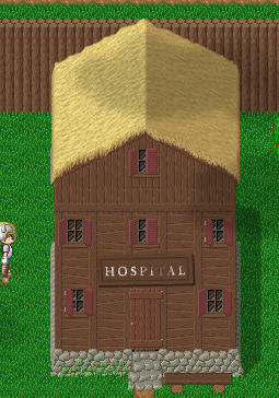
- Something like this?
- hospital-test.png (107.03 KiB) Viewed 1857 times
If anybody makes a single super mario world ghost house joke... well, just don't
.
Re: Red Cross signs
Posted: 06 May 2009, 16:43
by John P
I am completely sold on full text signs on some buildings. Also on the sign of the guy peeing in the water. Put a slash through that and put it next to ponds.
The Hospital sign looks awesome, but too detached and of unknown material. Also lift it above the door frame.
I don't think every town is going to have a full blown hospital though. So the small sign might still be needed in small towns with a clinic or just a doctor.
Re: Red Cross signs
Posted: 06 May 2009, 16:59
by Crush
I pushed this

sign and also a new version of the nurse sprite without the cross to git.
This does of course not mean that we are no longer open for different suggestions.