Page 1 of 2
[WIP] Beach add-ons - CR1 - Meway
Posted: 02 Dec 2009, 15:30
by AxlTrozz
Meway: please your current progress here and use it as a fresh start.
Re: [WIP] Beach add-ons - CR1 - Meway
Posted: 02 Dec 2009, 19:02
by meway
Re: [WIP] Beach add-ons - CR1 - Meway
Posted: 02 Dec 2009, 21:17
by Crush
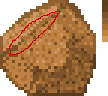
This might sound more insulting than it is really meant, but I really wonder what you are thinking while you shade stuff. No, I really want to know.
When I shade stuff I think where my light source is, picture my object three-dimensionally and think about what angle the surface I am currently drawing on has to the light source.
What are you basing your shading decisions on?

- rock-explained.PNG (3.16 KiB) Viewed 4180 times
The points A and B, for example. They seem to be parallel. They seem to have the same angle to the light source. Why is B so much darker than A?
What about that bright highlight on C? It is facing away from the light source, it should be much, much darker than A and B.
And what about that area D? Is it supposed to be flat or curved? When it is flat it shouldn't have a shading gradient. Flat surface means flat shading. When it is curved I wonder what direction it is curved in, either way something is wrong with it.
And what about E? It is THE surface facing the most away from the light source. It should be by far the darkest part. Still there are other surfaces which are much darker. Why?
Re: [WIP] Beach add-ons - CR1 - Meway
Posted: 03 Dec 2009, 15:58
by meway
crush as i said in my original post ""Its not shaded its 0.0 just detailed we will call it. lol"" in the file comment. Here I was only trying to find a nice shape. Here it is again with a little shading but I already see where it needs work just to keep you up to date

.
Re: [WIP] Beach add-ons - CR1 - Meway
Posted: 05 Dec 2009, 19:11
by meway
Any comments would be nice aside I forgot transparency.
Re: [WIP] Beach add-ons - CR1 - Meway
Posted: 05 Dec 2009, 19:59
by Crush
You are making progress but you still have a long way to go.
Why are you using gradients from bright to dark on surfaces which don't appear to be curved?
When you have a light source which is very weak and very close to your object (like a candle) this does make sense because the light intensity becomes weaker the further you get away from the light source. But when your light source is very strong and very far away (like the sun) you don't have this effect. A flat surface should have an uniform light intensity.
I drew you an example:
Re: [WIP] Beach add-ons - CR1 - Meway
Posted: 06 Dec 2009, 09:15
by meway
I honestly think

this is a down grade
of art but your the expert.

mood:

irritated
Re: [WIP] Beach add-ons - CR1 - Meway
Posted: 06 Dec 2009, 11:58
by Crush
Good so far. You are right that it still looks boring. But this is OK, because the fun part is still missing: texture.
How do you add texture?
The easiest way to do this is by dithering. Just sprinkle every shade with random single pixels of brighter and darker shades. This will make it appear like a rough surface instead of plastic. While doing this you will observe that some arrangements of pixels will make it appear like there are cracks, juts or dents in the surface. This is good - try to play with it.
Re: [WIP] Beach add-ons - CR1 - Meway
Posted: 06 Dec 2009, 22:29
by meway
Re: [WIP] Beach add-ons - CR1 - Meway
Posted: 06 Dec 2009, 22:54
by Crush
Good, now add some pixels of the next brighter shade where you dithered with the darker shade so that you have pixels of 3 brightness levels per surface.
Re: [WIP] Beach add-ons - CR1 - Meway
Posted: 07 Dec 2009, 01:15
by meway
like this?
Re: [WIP] Beach add-ons - CR1 - Meway
Posted: 07 Dec 2009, 17:53
by Crush
You are on the right track.
I would use less pixels but use more contrast instead. I would also do the same with the edges to make them appear rougher too.
Re: [WIP] Beach add-ons - CR1 - Meway
Posted: 07 Dec 2009, 19:27
by meway
I'm having trouble understanding contrast maybe this is what you meant? also i did change the color scale.
Re: [WIP] Beach add-ons - CR1 - Meway
Posted: 08 Dec 2009, 19:18
by meway
Re: [WIP] Beach add-ons - CR1 - Meway
Posted: 08 Dec 2009, 20:20
by Crush
meway wrote:I'm having trouble understanding contrast maybe this is what you meant? also i did change the color scale.

You are finally getting a hang of it. There is just one little detail, and that's this edge:
- higher contrast-rock-edge.PNG (1.75 KiB) Viewed 3785 times
The classical artist William-Adolphe Bouguereau once said that there isn't really a difference between line and plane. When you draw a line you are basically drawing a very thin plane. So when we perceive this edge as a plane instead of a line, what does that mean for its brightness level? Is it further away from the light source? No, it is facing the light source more than anything else. So it has to be drawn as a bright line instead of a dark one. You can see this technique being used in these rocks by Len:

More "geometric" examples can be found in the furniture from the woodland village indoor tileset.
If the color change was good or bad depends on where the object is supposed to be placed.