Page 2 of 4
Posted: 13 Sep 2005, 10:22
by maci
Syntax error near 6
Posted: 13 Sep 2005, 10:39
by Bjørn
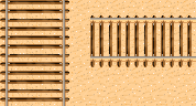
I think those rocks look great, as well as the piece of railroad! I do agree with Crush that it could probably use a bit of perspective correction. Just keep in mind that a horizontal piece of track should be about 2/3rd of the width that the track has in vertical direction:
Posted: 13 Sep 2005, 11:04
by Matt
I love the big I :>
Posted: 13 Sep 2005, 12:45
by Pajarico
beta stage rocks... they sucks.
Actually i like them

and yes to the perspective correction on the railroad.
Posted: 13 Sep 2005, 17:03
by Talaroc
Good work, tt's looking pretty nice at this point. I like all the scattered pebbles, so long as there's enough variance to keep it from looking tiled. From what I can see, you've got that going pretty well.
I agree with the comments that have already been posted about the railroad tracks.
Rocks: They look good. Some more shapes would be good, of course, particularly in the smaller ones since there's only one right now.
Bridges: The wooden bridge looks pretty good, although you might very the appearance of the vertical poles as they enter the ground, so they're not all identical. The tree bridge needs to lose the black outline, but otherwise was nicely done. And in truth, considering this is a desert area, I think all the wooden stuff should be lighter in color, as it has been "bleached" a bit by the harsh desert sun. Unless, of course, it's very new.
Riverbed: Very nice job on the banks. There are two main things I would look at here; the top edge of the riverbed (where it meets the regular ground) seems very sharp, which look s a bit odd. If it was made smoother in some places, I think it would look better. I say only in some places because that would also increase the visual variance of the tiles. The other thing to look at is the bottom of the riverbed; it could just be my screen, but the cracked ground at the bottom is very difficult to see--it look s almost like a flat color fill unless I get really close. So unless I'm the only one having trouble seeing that, you might increase the overall contrast of that.
Posted: 13 Sep 2005, 17:07
by i

better?
Posted: 13 Sep 2005, 17:35
by Talaroc
The traintrack looks quite improved. Very nice!
Posted: 13 Sep 2005, 17:59
by Matt
Mh...the railroad seems to big/fat/whatever to me

Posted: 13 Sep 2005, 18:21
by Crush
that depends on the size of the train.
Posted: 13 Sep 2005, 18:38
by Matt
But the current railroad size doesnt fit with the size of the bridge.
Posted: 13 Sep 2005, 19:16
by Rotonen
Perhaps some detoriation and decal would do good to the railroad..? It looks so static now.
The big rocks just.. well.. rock! (A fine example of detail, detoriation and decal.)
Rock on!
Posted: 13 Sep 2005, 21:51
by Modanung
Bjørn wrote:Just keep in mind that a horizontal piece of track should be about 2/3rd of the width that the track has in vertical direction
Also keep in mind that the broadnes of and the space between the planks in the vertical direction should be 2/3 of the measures in the horizontal direction.
Apart from the railroad fading to sandcolour at it's edges eventhough it's over a bridge... I think the track is a bit broad, this width would be perfect for a vertical railway.
I'm lovin' it, can't wait for the bends. And I'd love to make the train design (and maybe model it in 3d?).

And yes, your rocks rule the desert!

Posted: 22 Sep 2005, 20:30
by i
I'm lazy dude some personal reasons, anyway i had some time totday @ work...


Posted: 22 Sep 2005, 20:43
by maci
WOWWW...
that rock thingy is really great
i am so happy iru is in our team ^^
one suggestion.. have some variations on the dry river thingy.. i guess all the little sontes would repeat all the time on a map
Posted: 22 Sep 2005, 20:46
by degen
awesome work iru!!!
i really like how you built that dried up river
me guess your soon done with that for adding it to ingame or??