

The spider web, and small tiles with bones are cool as I probably said somewhere earlier. I'm not really against the prison, but something looks weird. In my opinion the bricks don't look that bad. The worse parts are the bars, they lack a 3D feeling, probably because of the lack of a real shading.
Sorry to say but I can't stand the skeleton
 TMW Italian community
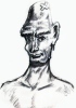


