Currently working on: window
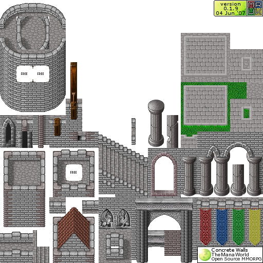
So I'm messing around with building a castle map using gimp to draw my own brick tilsets. S far I've got 5 tiles drawn (two of which are just inverted tiles). I was going to post the tileset but the transparency got jacked up apparently in the making of a single .png tileset so if anyone is interested I will post it and whatever else is part of the tileset when I get a single file tileset working. For now here is what it looks like screenshot out of Tiled:

The arches are transparent at the corners. Like in the desert city walls. Any comments welcome. I'm a little anal so I'll fix anything someone notices that I haven't I've been over and over these little pieces for quite a while getting them to arrange seamlessly and look as realistic as possible.
Edit - I put a picutre that actually makes more sense. When I thought about it, I had more accomplished than I thought so I put it together to look decent and more meaningfull. Also I was wrong, the tileset works perfectly. Here it is:

Also - IK it is kinda bland atm. I plan to add a lot of detail. LIke Arrow slits, a cool archway and drawbridge, A chapel with stained glass windows and more.
That's two more tiles!
+1
Okay, So I'm observing that my castle walls-and more notably-the towers, wll create some "hiding" places for mobs and players. Since this isn't really going to be a dangerous area and it's not a place where pertinant details to be observed at I can't think it should be too much of a problem. If it's a problem I can find a way to work around it and prevent it from happening but my towers might be a few pixels smaller.