Evil Eyeball Monster
Evil Eyeball Monster
I wanted to get a new monster in the game thats attack will vary from the typical bite/hit/kick/spit/etc. I created this eyeball with the hope that it will shoot a laser beam from its cornea and eventually, cast magic spells. Before I begin animating it, I want to make sure that I have a good beginning, so here it is. I am thinking that the animation will be fairly simple because I imagine it floating about, which seems simple to animate. The question I hope to get answered is: is this ready to begin animation?


- ElvenProgrammer
- Founder

- Posts: 2526
- Joined: 13 Apr 2004, 19:11
- Location: Italy
- Contact:
yeah is goodDr Wahl wrote:This is supposed to be the beginning of the downward motion, if that helps with perspective. Another idea popped into my head for animation. Instead of simply floating, I was thinking of doing some pulsating like this:
And here is an attempt at a different perspective:
It could use a bit more shading.
- former Manasource Programmer
- former TMW Pixel artist
- NOT a game master
Please do not send me any inquiries regarding player accounts on TMW.
You might have heard a certain rumor about me. This rumor is completely false. You might also have heard the other rumor about me. This rumor is 100% accurate.
AxlTrozz wrote:It's a very good start, my five cents, try to get a transparent effect in the iris (green zone) and use more AA.
I'm not exactly sure how to do the transparency (I tried and it looked like crap), and I don't know what "AA" is. I would love to learn how to do these things, so if you could give me a few pointers, I would love to try to improve my techniques.Crush wrote:It could use a bit more shading.
Crush, could you be a little more specific? What needs more shading, the white part of the eye? The iris? The Cornea? All of the above?
Thanks for the feedback!

I think he's talking about Anti Alias, which would make your lines smoother.
The second perspective looks really good IMO, though
The second perspective looks really good IMO, though
AA is anti-aliasing is just a way to handle lines and the color transitions, here an example...from dark to light green there are like 2 or 3 different tones (you will have to zoom the image to see it) but if you see the whole, it looks like a shinny jade stone.

Some guides from the Wiki
http://wiki.themanaworld.org/index.php/Guidelines

Some guides from the Wiki
http://wiki.themanaworld.org/index.php/Guidelines
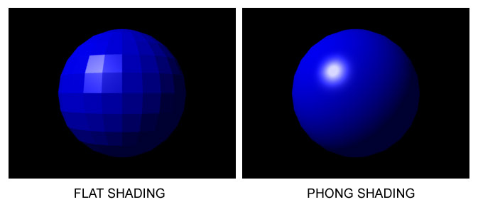
I mean the whole ball itself should be more shaded. Your ball got a highlight but it misses a shaded part.
Here an example how a sphere should be shaded:

Here an example how a sphere should be shaded:

- former Manasource Programmer
- former TMW Pixel artist
- NOT a game master
Please do not send me any inquiries regarding player accounts on TMW.
You might have heard a certain rumor about me. This rumor is completely false. You might also have heard the other rumor about me. This rumor is 100% accurate.
A floating eyeball seems a little generic to me
It might be fun to place it on a Player Sprite head and have it pulsate
http://farm1.static.flickr.com/136/3800 ... 05.jpg?v=0
It might be fun to place it on a Player Sprite head and have it pulsate
http://farm1.static.flickr.com/136/3800 ... 05.jpg?v=0

Pixel Battalion


 TMW Italian community


