Light Platemail Icon
I was bit bored so I decided to try to draw a new icon for the platemail:
What do you think?
What do you think?
Re: Light Platemail Icon
It still looks more like a shirt than a platemail.
I would suggest to make the shoulderpads larger. Also note that the original platemail becomes thinner at the waist.
- former Manasource Programmer
- former TMW Pixel artist
- NOT a game master
Please do not send me any inquiries regarding player accounts on TMW.
You might have heard a certain rumor about me. This rumor is completely false. You might also have heard the other rumor about me. This rumor is 100% accurate.
Re: Light Platemail Icon
Left old, right new.
Re: Light Platemail Icon
You got the breast part correctly in the 2nd one but the shoulder pads look even worse. Try to make them rounder.
- former Manasource Programmer
- former TMW Pixel artist
- NOT a game master
Please do not send me any inquiries regarding player accounts on TMW.
You might have heard a certain rumor about me. This rumor is completely false. You might also have heard the other rumor about me. This rumor is 100% accurate.
Re: Light Platemail Icon
- -
Like this?Crush wrote:You got the breast part correctly in the 2nd one but the shoulder pads look even worse. Try to make them rounder.
Re: Light Platemail Icon
or like this...
Re: Light Platemail Icon
yeaaa... watch this!
Re: Light Platemail Icon
I like the breast detail at the 4th version, but the shoulderpad looks just too different from the original.
- former Manasource Programmer
- former TMW Pixel artist
- NOT a game master
Please do not send me any inquiries regarding player accounts on TMW.
You might have heard a certain rumor about me. This rumor is completely false. You might also have heard the other rumor about me. This rumor is 100% accurate.
Re: Light Platemail Icon
Collaboration, challenging each other and being productive. This is what I have wanted to see for years.
Keep this up.
Keep this up.
This message used to be meaningful.
Re: Light Platemail Icon
Im not sure about the 4th version because the sprite doesn't include the breast detail, and I go the feeling that the colour is off.
Re: Light Platemail Icon
A New version...
Re: Light Platemail Icon
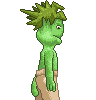
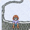
After a little break I present my next try, I used Iru version as a base because I think his version looks like the lightplatemail sprite, while AxlTrozz is really nice, it just doesnt look like the sprite. I tried to redraw the front arm because the position the arm is looks weird, like he is holding it backwards. Im not to happy about this icon yet, but it might be a improvement.
Left Iru's version, right my new version:
- Sertraline
- Novice
- Posts: 128
- Joined: 02 Dec 2007, 03:29
- Location: Austin, TX, USA
Re: Light Platemail Icon
Notice how the shoulder-pads bulge out significantly in the current one. Both yours and Iru's lay basically flat, making the shoulders appear very narrow.
Re: Light Platemail Icon
Hi,
yet another attempt:
-- fate
yet another attempt:
-- fate