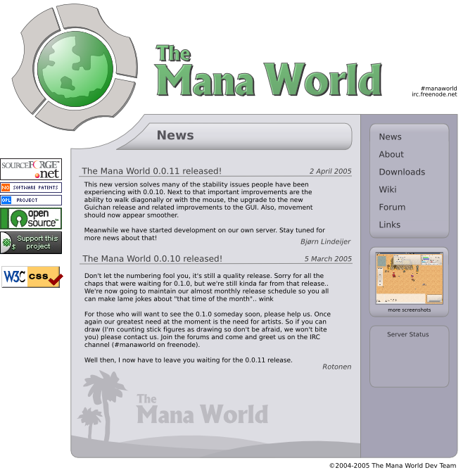
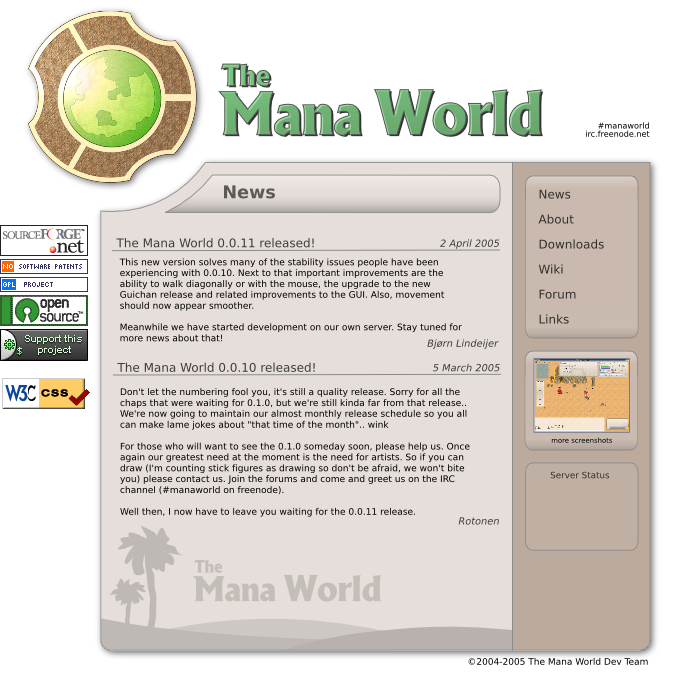
Wow, thats 100% better

It looks really good -- only one last suggestion

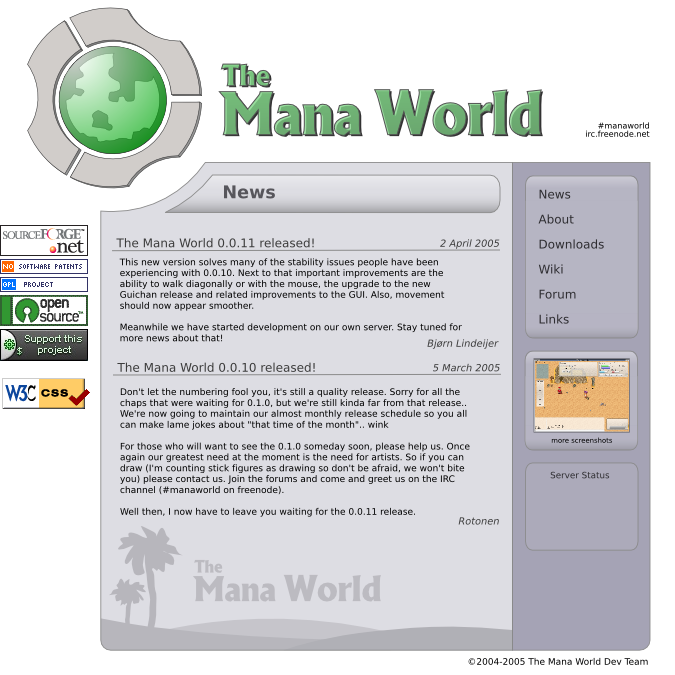
(hehe). I would probably remove (or lessen to barely see'able) the gradients from the "News" title and the menu backgrounds on the right side. The gradients are about the only thing making it still look futuristic (the smooth curves also, but that is mostly negligable).
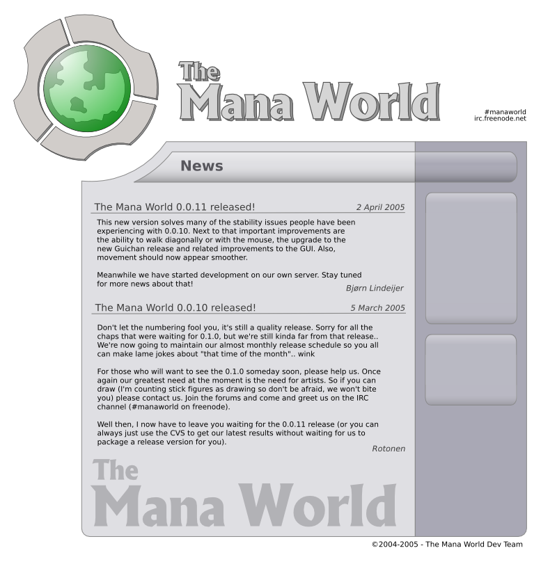
The color scheme is much butter imo, as it fits the context better as a fantasy role playing game (yes, changing the base color can have that effect). You also may want to play around with some other things, like news footer ("The Mana World" with hills and trees) color, maybe adding a tint of green to the leaves, and maybe adding some yellow the the hills to look more like sand (or green if you want
). Another thing you could play around with is the background color of the pages, try maybe an off-white color.
Very good work Hammerbear


 TMW Italian community


