New website design


-
Bjørn

- Manasource

- Posts: 1497
- Joined: 09 Dec 2004, 18:50
- Location: North Rhine-Westphalia, Germany
- Contact:
Hmm wel we can consider making the blue a user option if some people really like it better than the brown... also the gradient in the sidebar was a mistake, it was easy in inkscape but it's not straightforward to do that in an HTML page unless the width is fixed, which I don't want to do.
So now I'm proposing a final design (well of at least the default...), after tweaking colors just a bit and adding the avatars:
Edit: fixed a size and an ordering problem.
Edit 2: added version with shadow: http://www.lindeijer.nl/~bjorn/tmwwebsi ... shadow.png
So now I'm proposing a final design (well of at least the default...), after tweaking colors just a bit and adding the avatars:

Edit: fixed a size and an ordering problem.
Edit 2: added version with shadow: http://www.lindeijer.nl/~bjorn/tmwwebsi ... shadow.png
Last edited by Bjørn on 08 Apr 2005, 02:41, edited 1 time in total.


yeah there is allready a updated version in the logo thread http://themanaworld.sourceforge.net/php ... 3&start=45
ElvenProgrammer wrote:Maci: don't be rude, we're here to help people


-
ElvenProgrammer

- Founder

- Posts: 2526
- Joined: 13 Apr 2004, 19:11
- Location: Italy
- Contact:
 TMW Italian community
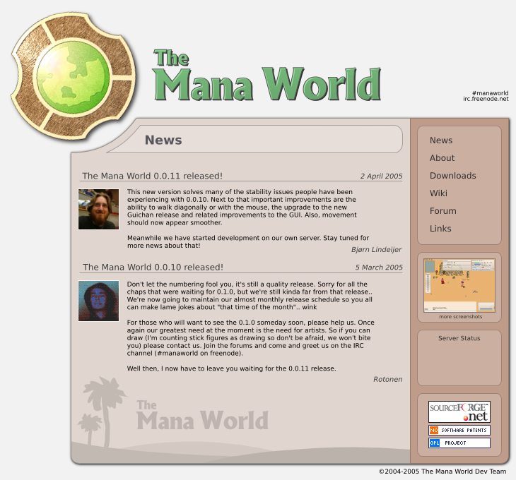
Rotonen: nice idea
but about the style .. could anyone with some less free time try o make what i suggested here:
http://themanaworld.org/phpBB2/viewtopi ... =4153#4153
thx in advance
but about the style .. could anyone with some less free time try o make what i suggested here:
http://themanaworld.org/phpBB2/viewtopi ... =4153#4153
thx in advance
ElvenProgrammer wrote:Maci: don't be rude, we're here to help people
-
Bjørn
- Manasource
- Posts: 1497
- Joined: 09 Dec 2004, 18:50
- Location: North Rhine-Westphalia, Germany
- Contact:
Well I'm a good way into the realisation of this website. For now I'm ignoring the blue version, if there's enough interest somebody will be able to modify the bitmaps and stylesheet relatively easily to provide that style as an alternative. Since the last image I posted here I added a dropshadow and gave the site more contrast.
Here's a link to the current preview:
http://www.lindeijer.nl/~bjorn/tmwwebsite3/
I've tested it in Opera, Konqueror (KHTML), Epiphany (Gecko) and IE 6. For the last one I had to insert several hacks to get it to render right, and there's still a strange problem when you use the back button to go back a page. With all the other sites keeping straight to the standards, this browser really is a bunch of crap. I hope few people will visit our site with it.
I think the contrast filter has made the logo look a tad strange maybe. So maybe Iru could make a better version using this kind of contrast.
-
ElvenProgrammer
- Founder
- Posts: 2526
- Joined: 13 Apr 2004, 19:11
- Location: Italy
- Contact:
-
Bjørn
- Manasource
- Posts: 1497
- Joined: 09 Dec 2004, 18:50
- Location: North Rhine-Westphalia, Germany
- Contact:
I've reduced the contrast on the logo and fixed the collapsed banners problem in IE. I've also reorganized the header so that it is now a single image, making it easier to modify. Unfortunately this means it is now paletted otherwise IE doesn't do transparency right. As a sideeffect this seems to have solved the background drawing problem with using the back button in IE. New URL here:
http://www.lindeijer.nl/~bjorn/tmwwebsite4/
On my WinXP any non-bold fonts on the website appear in italic btw, I hope this means my Windows installation is corrupt and not that everybody has this problem. I'm assuming it's a Windows bug as Firefox does the same.
maci: I can't just stick in Elven's silver logo, I don't think it would fit the other colors and personally I like this one better. Also, the gradient would be a bit hard to add and I think you're the only one who responded positive to that.
-
ElvenProgrammer
- Founder
- Posts: 2526
- Joined: 13 Apr 2004, 19:11
- Location: Italy
- Contact: