All development of pixel art, maps and other graphics.
Rotonen
TMW Adviser
Posts: 3154 Joined: 08 Sep 2004, 19:48Location: Bern, Switzerland
Post
by Rotonen 18 Aug 2009, 13:37
Beautiful palette usage.
This message used to be meaningful.
yosuhara
Knight
Posts: 583 Joined: 16 Mar 2006, 21:19Location: Slovakia
Contact:
Post
by yosuhara 18 Aug 2009, 15:14
haay's original sprite is the best so far...
Rotonen
TMW Adviser
Posts: 3154 Joined: 08 Sep 2004, 19:48Location: Bern, Switzerland
Post
by Rotonen 18 Aug 2009, 16:44
The reflection on the original is really nice.
This message used to be meaningful.
Black Don
Knight
Posts: 660 Joined: 06 Feb 2008, 21:30
Post
by Black Don 18 Aug 2009, 20:10
I quite like the subtle detailing on the one second from the left
"Too much of a good thing is an awesome thing, but too much of an awesome thing is, um, really really dumb. And bad." Strong Bad
Rotonen
TMW Adviser
Posts: 3154 Joined: 08 Sep 2004, 19:48Location: Bern, Switzerland
Post
by Rotonen 19 Aug 2009, 10:17
I like the original helmet the best.
This message used to be meaningful.
EJlol
TMW Furniture
Posts: 1224 Joined: 06 Sep 2005, 08:42
Post
by EJlol 19 Aug 2009, 11:32
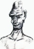
I tried to improve the shading of helmet to make it look a bit more metallike:
Savi
Novice
Posts: 107 Joined: 18 Jan 2009, 19:14
Post
by Savi 19 Aug 2009, 17:30
Looking at the guard it appears that he is standing at ease. What if when a player approaches the guard he stands at attention until you move away. A guard at attention would give the spear a more vertical appearance, his shield would be in front of the body and in a vertical position and both feet pointed forward.
EJlol
TMW Furniture
Posts: 1224 Joined: 06 Sep 2005, 08:42
Post
by EJlol 19 Aug 2009, 18:18
First I will finish this stance, after that we can always add extra frames with different stances / weapons / etc.
Spit23
Novice
Posts: 191 Joined: 08 Aug 2008, 08:07Location: Germany
Post
by Spit23 20 Aug 2009, 10:58
The last graphic looks really cool, but I would like to see more reflection like in Haays first graphic. That would look really awesome.
vox populi
Peon
Posts: 31 Joined: 20 Aug 2009, 10:47Location: Everywhere.
Post
by vox populi 20 Aug 2009, 11:01
I like first and last and some of the middle ones. Could they all be used for different guards?
EJlol
TMW Furniture
Posts: 1224 Joined: 06 Sep 2005, 08:42
Post
by EJlol 20 Aug 2009, 11:07
vox populi
Peon
Posts: 31 Joined: 20 Aug 2009, 10:47Location: Everywhere.
Post
by vox populi 20 Aug 2009, 12:01
Yes, this latest edit is certainly getting more of a battered yet shiny metal feel to it...


 Photobucket