Well, what I meant was, the actual pots can take up that whole space. But anyway.
Some tips to help you out. The general construction of the pots is nice, and with a little bit of work they can really look quite good. A few things to help do so:
* Take out the black outlines. It's really tempting to outline everything; I know. It's actually one of the hardest things to learn to overcome, but when you do the effect is a lot better. If you want to outline things, do it with a darker shade of the color of the object.
* It's the shading that will give them shape and make them look three-dimensional. The best thing you can do to learn to do that sort of shading, especially on difficult things like glass pots, is to look at photos and other people's sprites, and then play around and try to emulate it. For an example, here's a graphic I posted a while ago for the magic system:
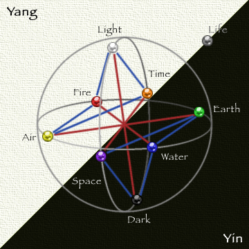
Look closely at the gems. The shading on them looks complex, but it's actually quite simple. There's two light dots, two dark dots, a dark "v" shape, and a dark crscent (at the bottom). And that's all it takes to make them look 3D, shiny, and translucent.
If you apply that to your pots, and play around a little bit, you can come up with good "glass" effects pretty easily. My recommendation would be: first, take all the current shading and stuff out, so it's just a solid color. Next, decide how much of the pot is filled with liquid; make that part darker. Then, work on adding some light shines along the left side of the pot, as though sunlight is shining on it from the upper left. Next, add a darker "shadow" area in the lower right. Make sure most of the shading, both light and dark, is mostly to the sides of the pot, with not much in the middle. THat should give it a good 3D look.
Go ahead and give it another go (feel free to ignore my recommendations if you figure out something that you feel looks better), post it and let's see!


 TMW Italian community