You call that incredibly high-saturated?Ultim wrote:
Desert Dried River Tileset
-
Modanung

- Grand Knight

- Posts: 1719
- Joined: 20 May 2005, 15:51
- Location: Groningen, The Netherlands
- Contact:

If you're looking for 3D FOSS games be sure to check out LucKey Productions on itch.io


On the pics, one by one:
1. Good example. A few high-saturation colors on a screen wherein the vast majority of colors are low-saturation.
2. Again, the vast majorty of the colors in this picture are low-saturation.
3. A good reason why not to go high-saturation. The screen is too visually busy; it's difficult to distingish between background and foreground,between important and unimportant. Where such a distinguishment cannot be made by the three-dimensional process of focusing in the eye, it must be made visually by other means.
4. Again, low saturation. The life hearts are the brightest thing in that picture.
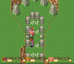
5. Is that a photo of the screen? Things in Star Fox don't generally glow like that.
6. Your first example of a high-saturation picture that works. In this case, it's due to the high degree in contrast between the exceptionally busy (but unimportant) background and the very clean play area. Again, visual contrast is the key.
7. I just have to ask, do you honestly think that looks good? 90% of the screen is one shade of one color. This example is also, in my opinion, irrelevant; they only had a few colors to work with due to technological restrictions, and so had to choose a broad color palette for flexibility. We have no such restriction, as evidenced by the fact that I use more colors in my character sprites than were used in that entire game.
You can't just say "hey, the games I played on the SNES had bright colors, so all our colors should be bright and saturated!" You'll come out with a visual mess, especially if we include a high degree of detail (as we really must, to create an interesting overall world).
You also have to take into account location, style, and feel. I, personally, don't like how highly saturated the new woodland tileset sprites are, because it doesn't give the sense of being woodland; woodland implies a lot of tree cover, which means a lot of shade. They tend to be dark. These are the same sort of considerations that were made in the games you're looking at and all similar games, except in certain specific cases wherein considerations like that were deliberately ignored. If you want an easy example from a game I'm rather sure you'll take into account, let's compare the grass tiles that have been largely the center of this debate...

...with the grass tiles from SoM.
Edit: fixed image link
See what I mean here?
1. Good example. A few high-saturation colors on a screen wherein the vast majority of colors are low-saturation.
2. Again, the vast majorty of the colors in this picture are low-saturation.
3. A good reason why not to go high-saturation. The screen is too visually busy; it's difficult to distingish between background and foreground,between important and unimportant. Where such a distinguishment cannot be made by the three-dimensional process of focusing in the eye, it must be made visually by other means.
4. Again, low saturation. The life hearts are the brightest thing in that picture.
5. Is that a photo of the screen? Things in Star Fox don't generally glow like that.
6. Your first example of a high-saturation picture that works. In this case, it's due to the high degree in contrast between the exceptionally busy (but unimportant) background and the very clean play area. Again, visual contrast is the key.
7. I just have to ask, do you honestly think that looks good? 90% of the screen is one shade of one color. This example is also, in my opinion, irrelevant; they only had a few colors to work with due to technological restrictions, and so had to choose a broad color palette for flexibility. We have no such restriction, as evidenced by the fact that I use more colors in my character sprites than were used in that entire game.
You can't just say "hey, the games I played on the SNES had bright colors, so all our colors should be bright and saturated!" You'll come out with a visual mess, especially if we include a high degree of detail (as we really must, to create an interesting overall world).
You also have to take into account location, style, and feel. I, personally, don't like how highly saturated the new woodland tileset sprites are, because it doesn't give the sense of being woodland; woodland implies a lot of tree cover, which means a lot of shade. They tend to be dark. These are the same sort of considerations that were made in the games you're looking at and all similar games, except in certain specific cases wherein considerations like that were deliberately ignored. If you want an easy example from a game I'm rather sure you'll take into account, let's compare the grass tiles that have been largely the center of this debate...
...with the grass tiles from SoM.
Edit: fixed image link
See what I mean here?
Last edited by Talaroc on 27 Sep 2005, 17:39, edited 1 time in total.
The point was that we all grew up on Nintendo, who did all the saturation too. When those of us Nintendo kids think about graphics colors, we instantly think bright and bold. Those snapshots were just from games that had some high saturation (yeah Zelda did too, even if it isn't represented well in that picture. Isn't Windwaker hugely high saturation?). i like high saturation. i think it makes things stand out and not look too real (after all, we're doing a 2D fantasy). i don't think it's necessary and i know many people, like Talaroc, don't like it. So i try to compromise usually.
i just realized that a lot of the high saturation is in the more important objects... hm. Come to think of it, that's the way in a lot of the SNES games. i think we should make our sprites high saturation and our tiles low saturation. Except for some key tiles (trees, water,etc.)
Oh and that SoM grass tile link is broken.
-
Bjørn

- Manasource

- Posts: 1438
- Joined: 09 Dec 2004, 18:50
- Location: North Rhine-Westphalia, Germany
- Contact:
To me it's pretty obvious that the Nintendo graphics in Zelda or SoM are actually NOT as saturated as these graphics by Crush, and it also seems they had higher contrast.
In any case I want to stress that I really like what Crush is drawing, and saturation/contrast are things that can be tweaked easily later.
In any case I want to stress that I really like what Crush is drawing, and saturation/contrast are things that can be tweaked easily later.
Saturation on a scale of 0 to 240:
The arrow icon has 180. The bomb icon has 197. The guards' armor sports 199. Their shields have 201. Is it getting less obvious yet? Link's hair an astounding 215. The little yellow outline of the chosen weapon has 225 saturation.
If it's still not obvious, then let me tell you that in all cases, when the saturation was maxed out (240), the change was almost imperceptible.
But yeah we can manage the colors into a muddy boring mess later on. Pretty easily.
-
Bjørn
- Manasource
- Posts: 1438
- Joined: 09 Dec 2004, 18:50
- Location: North Rhine-Westphalia, Germany
- Contact:
What the hell? It seems we're looking at completely different parts here. I just measured the Zelda, SoM and Crush's grass for saturation:Ultim wrote:Saturation on a scale of 0 to 240:
The arrow icon has 180. The bomb icon has 197. The guards' armor sports 199. Their shields have 201. Is it getting less obvious yet? Link's hair an astounding 215. The little yellow outline of the chosen weapon has 225 saturation.
If it's still not obvious, then let me tell you that in all cases, when the saturation was maxed out (240), the change was almost imperceptible.
But yeah we can manage the colors into a muddy boring mess later on. Pretty easily.
Zelda: 43%, SoM: 57%, Crush: 86%
Is this getting obvious now? We're talking about general saturation here, not the saturation used to highlight certain parts (like the weapon outline). As the latter is indeed fine and looks good, but the former makes the whole thing look unrealistic.
Note that every time that I reduced the saturation of Crush's set, I've specifically only reduced the saturation of the grass, and nothing else.

Let us remember the words of the great Bros. Brudlos:
"If you put a marble into a bucket of marbles, it is nothing special; if you put it into a bucket of chicken nuggets, it is unique."
Or in my words;
"If you yell at the top of your lungs at a monster-truck rally, no one will hear you. If you yell at the top of your lungs in church, everyone will hear you."
If you save the high saturation for a few, distinct elements in your art, they will look much more remarkable. Much more noticeable, much more unique.
Advanced techniques will afford additional benefits in the selective use of saturation; right now, it at least will make certain things much more potent.
This basic principle is used to great effect on things like magic effects, or torches, or otherwise - if you save the high saturation for those rare things like pyrotechnics, fire, and flowers, they will stand out just as much as their real world counterparts. This is one of the tricks to adding that "vitality" that pervades better sprite art.
And if you want a different analogy, this is like the principle in martial arts known as control. Knowing when to hold back allows you to use full power when it actually counts.
i can agree with that. Would it not be wise then to fade the saturation with the shades of grass? i usually keep a corellation between the brightness and saturation and it hasn't failed me yet. (By the way, Bjørn, i feel i've made you angry. Know that i didn't intend to and will try harder not to)
-
Bjørn
- Manasource
- Posts: 1438
- Joined: 09 Dec 2004, 18:50
- Location: North Rhine-Westphalia, Germany
- Contact:
I was more surprised than angry, I will try harder not to appear too angry. :-)Ultim wrote:i can agree with that. Would it not be wise then to fade the saturation with the shades of grass? i usually keep a corellation between the brightness and saturation and it hasn't failed me yet. (By the way, Bjørn, i feel i've made you angry. Know that i didn't intend to and will try harder not to)