Page 1 of 1
[CONTEST]Evol Online logo
Posted: 23 Sep 2013, 20:02
by WildX
Alright, Evol needs a new logo. Feel free to post concepts for designs or even finished logos here. The best finished product will be chosen as the new logo before the release of Aurora1. You can definitely submit multiple options as well if you want.
The logo needs to be simple, relevant to Evol and, of course, good looking.
It seems obvious, but do not use any copyright protected material.
Re: Evol Online logo contest
Posted: 23 Sep 2013, 21:41
by Reid
As concept I though about using a tree, it's in my opinion a good symbole of evolution and it could fit well a fantasy/medieval MMORPG.
It could be good to show some gameplay through this logo as well, a blank and simplist logo doesn't attract more the eyes.
As theme, we can use the piou which is present in most places of evol, same for the 4 guilds which represent a great part of the gameplay that we're working on.
I let you decide in which way you want to work, any work is welcome!
Re: Evol Online logo contest
Posted: 30 Oct 2013, 10:19
by mas886
Hi everyone, to help a little I decided to do a logo, it tooks me some hours, but the results are still not very good, I don't do that type of thigs so often, but well, I did all in my hand, I hope you can do something with it. I have two versions of it, one with the tree and another without the tree. If the size is a problem i have the original versions in 1280 x 720, but I resized them for the upload.
Re: Evol Online logo contest
Posted: 30 Oct 2013, 16:15
by WildX
mas886 wrote:Hi everyone, to help a little I decided to do a logo, it tooks me some hours, but the results are still not very good, I don't do that type of thigs so often, but well, I did all in my hand, I hope you can do something with it. I have two versions of it, one with the tree and another without the tree. If the size is a problem i have the original versions in 1280 x 720, but I resized them for the upload.
Maybe I should have mentioned, we do need an image to represent Evol, but we cannot use the tree anymore. A new image/symbol is part of the designing a new logo challenge. Yours is a very good start anyway, if you'd like to keep working on it we could have a great logo soon!

Re: Evol Online logo contest
Posted: 30 Oct 2013, 18:29
by mas886
Yes I know but i'm not enough cualfied to draw another tree or a symbol, I'm not very good at drawig even in the photoshop :/
Re: Evol Online logo contest
Posted: 30 Oct 2013, 18:36
by WildX
mas886 wrote:Yes I know but i'm not enough cualfied to draw another tree or a symbol, I'm not very good at drawig even in the photoshop :/
Ah well. I really like the font you used btw
Re: Evol Online logo contest
Posted: 31 Oct 2013, 08:20
by Elvano
WildX wrote: we cannot use the tree anymore.
Yea, we really can't.. =p
Might be a good idea to add that yto the original post as well? ;o
mas886 wrote: I'm not very good at drawig even in the photoshop :/
Who uses photoshop when you can use
GIMP? D;
Take it from me, someone who can't draw whatsoever, that the tool you should learn to use is
Inkscape.
It allows people who can't draw at all to make great things.
Another reminder, you can not use copyright protected materials in the result, but you can use references as long you do not copy.
And I'd strongly recommand anyone to use references, especially for things such as trees. =p
Re: Evol Online logo contest
Posted: 31 Oct 2013, 10:11
by mas886
Elvano wrote:Who uses photoshop when you can use GIMP? D;
I know to use gimp, but for me is easier to add filters and effects to the text using photoshop, i don't know how to do that in gimp, but for normal edits i prefer gimp
Re: [CONTEST]Evol Online logo
Posted: 26 Feb 2015, 12:56
by Reid
I post some artworks from Kansu/
Kolokolna for the future evol logo.
Re: [CONTEST]Evol Online logo
Posted: 09 Sep 2015, 21:28
by Kansu
Good people of Evol, here are some new sketches for the logo. If you like any of them, comment, please.
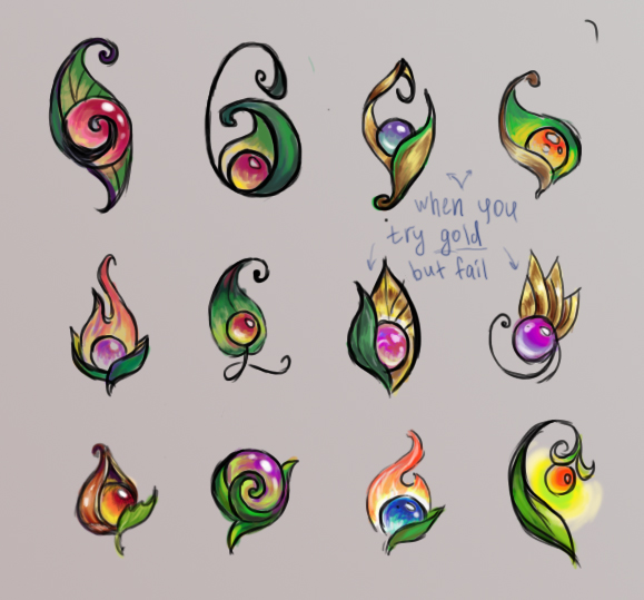
Re: [CONTEST]Evol Online logo
Posted: 10 Sep 2015, 13:36
by mas886
I really like the two first of the first row, and the last of the third row.
But they are all actually very good looking.
Re: [CONTEST]Evol Online logo
Posted: 10 Sep 2015, 13:41
by ozthokk
Kansu wrote:Good people of Evol, here are some new sketches for the logo. If you like any of them, comment, please.
WOW, to tell the truth, i like them all well done, but there are 3 that i like best,
1st in 2nd row
4th in 3rd row
3rd in 3rd row
The flames and lightning bug bud, I think that Evol's new logo should give light
Re: [CONTEST]Evol Online logo
Posted: 10 Sep 2015, 16:56
by EJlol
Am I the only one that likes the last one (4th in 3rd row) less? I don't like the glow... I also think the glow works less well for an icon?
My top 3:
1st row, 3rd
1st row, 4th
2nd row, 3rd
Re: [CONTEST]Evol Online logo
Posted: 16 Sep 2015, 18:04
by Alige
Hi guys,
I really like the 2nd one of the 2nd row. It makes me think that we could write down "Evol Online" entirely using that style. I'm not saying that we should put a pearl on every single letter, but some small pearls here and there would be nice.
Also, I see Evol like a game that takes place in natural environments, thus I really like the use of deep green leaves and dark brown, for branches, directly in the title.
To sum up:
Big Title:
- Write the title (in gold color) using the 2nd/2nd logo form
- Put in a few pearls (of different colors) (#3-5)
- Use branches and leaves "naturalize" the title
Logo:
- Use a green leaf + a branch & golden pearl
- No need to write down any letters, not appropriate in a logo
- I like Kansu's test in Reid's last post, 1st row, 2nd one