Axl & Eman Art Dump


when you plan to always place the torches between the columns it would maybe not be the worst idea to ignore the usual "light source from south-west-up" rule and light the columns and the ark from the direction of the torch.
- former Manasource Programmer
- former TMW Pixel artist
- NOT a game master
Please do not send me any inquiries regarding player accounts on TMW.
You might have heard a certain rumor about me. This rumor is completely false. You might also have heard the other rumor about me. This rumor is 100% accurate.


shouldn't the middle column be on one level with other two? it's placed 2 pixels away. I prefer the version no.1 and arc need to be fixed.AxlTrozz wrote:too much real life, but i have partially something to show you, i will take the rest of my day to finish all the details but here you have an advance...i have two options


brief:
1. two pixels diff in column is corrected
2. shadows (im not good with that but thats why im here)
3. i added the torches
4. added light reflections in the bricks and floor
5. darker floor
6. i tried to have more consistency this time
but still nedd work on light reflection in the middle column because it looks still odd
also i have an idea replacing the bricks

the picture shows a one pixel white line (top left) but it doesn't exist in my file so ignore it.
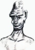
The char is really ligthed and looks odd when i put it in the map, but i think we can add something like the cave shadow to fixit, is that possible ?
P.D. The torch are suppost to be magic, thas why the light balls are suspended in the air
1. two pixels diff in column is corrected
2. shadows (im not good with that but thats why im here)
3. i added the torches
4. added light reflections in the bricks and floor
5. darker floor
6. i tried to have more consistency this time
but still nedd work on light reflection in the middle column because it looks still odd
also i have an idea replacing the bricks
the picture shows a one pixel white line (top left) but it doesn't exist in my file so ignore it.
The char is really ligthed and looks odd when i put it in the map, but i think we can add something like the cave shadow to fixit, is that possible ?
P.D. The torch are suppost to be magic, thas why the light balls are suspended in the air
Don't overdo it with the light and shadow effects.
1. the shadows won't fall on the player and monster sprites like the player would expect. Using too many complex shadows will look strange when they interact with mobile objects
2. All those shadow and light tiles are a mappers nightmare and very hard to combine.
1. the shadows won't fall on the player and monster sprites like the player would expect. Using too many complex shadows will look strange when they interact with mobile objects
2. All those shadow and light tiles are a mappers nightmare and very hard to combine.
- former Manasource Programmer
- former TMW Pixel artist
- NOT a game master
Please do not send me any inquiries regarding player accounts on TMW.
You might have heard a certain rumor about me. This rumor is completely false. You might also have heard the other rumor about me. This rumor is 100% accurate.


Ah yes! Much MUCH better! Now, whether you replace the bricks or not, I think they look quite odd. Your main problem is that you have the arch, then a sudden cut-away, then bricks, then more cut-away, etc. Try to have the top 10-20 pixels or so continue over into the brick area. That will give a far better feeling to it. Also, as Crush said, don't overdo the light/shadow stuff too much. It's definitely looking good though!AxlTrozz wrote:brief:
1. two pixels diff in column is corrected
2. shadows (im not good with that but thats why im here)
3. i added the torches
4. added light reflections in the bricks and floor
5. darker floor
6. i tried to have more consistency this time
but still nedd work on light reflection in the middle column because it looks still odd
also i have an idea replacing the bricks
the picture shows a one pixel white line (top left) but it doesn't exist in my file so ignore it.
The char is really ligthed and looks odd when i put it in the map, but i think we can add something like the cave shadow to fixit, is that possible ?
P.D. The torch are suppost to be magic, thas why the light balls are suspended in the air

If people find it odd, they find it new. If they find it new, it just might be original enough.Bjørn wrote:Something I find strange is that the temple has two entrances, and also that each entrance has a pillar in the middle. It seems to be heavily based on ancient Greek temples, but they always have the main entrance in the middle with 4, 6, 8 or 10 columns at the front.
This message used to be meaningful.
well, they are two versions, left and right, the i have to create the rest, if you see the middle column in the arch is different (with and without top column head)Bjørn wrote:Something I find strange is that the temple has two entrances, and also that each entrance has a pillar in the middle. It seems to be heavily based on ancient Greek temples, but they always have the main entrance in the middle with 4, 6, 8 or 10 columns at the front.
brief:
1. Rollback light effects in the floor
2. wall reach both sides
3. some bricks replaced by what i call masonry
4. added a column shape behind the torch

P.D. i dont know why the right side is cropped when i posted to the forum, anyway i think it would be good if you open the image in a new window (hope so)
1. Rollback light effects in the floor
2. wall reach both sides
3. some bricks replaced by what i call masonry
4. added a column shape behind the torch
P.D. i dont know why the right side is cropped when i posted to the forum, anyway i think it would be good if you open the image in a new window (hope so)

Judging from the position of the torches and the dropshadows the vertical columns are lit wrong. The bright parts should be dark and the dark parts bright.
And then there is something wrong with the perspective of the horizontal columns. Look at the point where the horizontal column meets the arc. Something is wrong there.
But besides that the tileset is making very promising progress.
And then there is something wrong with the perspective of the horizontal columns. Look at the point where the horizontal column meets the arc. Something is wrong there.
But besides that the tileset is making very promising progress.
- former Manasource Programmer
- former TMW Pixel artist
- NOT a game master
Please do not send me any inquiries regarding player accounts on TMW.
You might have heard a certain rumor about me. This rumor is completely false. You might also have heard the other rumor about me. This rumor is 100% accurate.