Page 1 of 2
Dark Armor and Dragon
Posted: 07 Oct 2007, 21:58
by javascribe
Hello all.
I'm new here. I am too busy now, but when I have spare time,
I would like to help out with this project. Here are my skills:
I am an amatuer Java programmer. But since I do not know C, I probably cannot help with the server.
I am also a novice pixel artist.
Anyways, on to the images.
I have drawn a dark helm, a dark platebody, and some dark platelegs. I have yet to finish the animations.
The idea goes that it is made out of a substance called shadowsteel, the concentrated essence of shadow in metallic form.
The armor has furthermore been blessed by the God of evil, hence the red symbol and decor.
All three images have been drawn onto this figure:

I have also drawn a dragon:

It is composed of seperate shapes (Which is probably how the right side got cut off), so I suppose animations are flexible, especially with clever scripting.
The legs and backside need more work. I also need suggestions for detail. Comments anyone?
Posted: 08 Oct 2007, 00:56
by Crush
Regarding the armor: It is so dark that you can't make out any body shape anymore. Just because something is pitch black doesn't mean that it doesn't need to be shaded. Setting some highlights with a bright grey tone does look really neat on black.
Regarding the dragon: I assume that this collection of polygons is only a very early scetch to check the propotions and not how you really want it to look. Except when you want it to be a robo-dragon. Straight lines should never be used when you design something that is not man-made. Or can you name any animal or plant that has a line somewhere that is perfectly straight?
Re: Dark Armor and Dragon
Posted: 08 Oct 2007, 01:26
by Blamoo
javascribe wrote:
YAY! ORIGAMI!
Posted: 08 Oct 2007, 02:09
by javascribe
I know, the armor needs better shading. Do you know where I could find tutorials on that?
Edit: Found one!
And yes, the dragon image is mainly a concept sketch, which is part of why I need advice on details. So I should probably smoothen out most of the hard angles. Do you think I should add scratch marks or scales?
Posted: 08 Oct 2007, 02:49
by javascribe
I probably need to find a better way to add scales, but does the shape look better?

Posted: 08 Oct 2007, 11:18
by Len
javascribe wrote:I probably need to find a better way to add scales, but does the shape look better?
No offense, but I believe you need to start over...Your not creating a 3D model, you don't need a wire frame. Just sketch it out before you do anything else.
Posted: 08 Oct 2007, 13:57
by javascribe
Your not creating a 3D model, you don't need a wire frame.
Wire frame? Do you mean the triangle constructs? That's probably a coincidence as I didn't use Blender.
Well in any case, do you have any suggestions on how to do scales?
Posted: 08 Oct 2007, 14:09
by AxlTrozz
My advice is,
1. look for inspiration in nature or any other source
2. start drawing any idea you get from your inspiration (draw a lot)
3. pixelate just the outline of what you like
4. try to get oppinions/suggestions/comments when you have something you like and looks good
IMHO this could be a good creative process
Regards
Posted: 08 Oct 2007, 14:31
by Crush
When it is your first project you should better start with something smaller and not already with a huge 512x512 pixel monster.
Posted: 08 Oct 2007, 22:17
by javascribe
When it is your first project you should better start with something smaller and not already with a huge 512x512 pixel monster.
Yes, you're right. I can always come back to this later. In the meantime, I'll work on shading the armor and perhaps draw some smaller creatures.
Posted: 09 Oct 2007, 04:01
by javascribe
How is the turtle?

Does it need more, or is it ready for animating?
Posted: 09 Oct 2007, 04:16
by Saphy
javascribe wrote:How is the turtle?
Does it need more, or is it ready for animating?
I believe it is a good start. However, the game uses a different perspective, ~45 degree from the top. Crush could probably show you the links about the game's perspective. You would also need to take lighting and shading into consideration.
Also, it may be a good idea to tone down the saturation a bit.
Posted: 09 Oct 2007, 04:38
by Crush
Here a good tutorial on shading in pixel art:
http://www.natomic.com/hosted/marks/mpat/shading.html
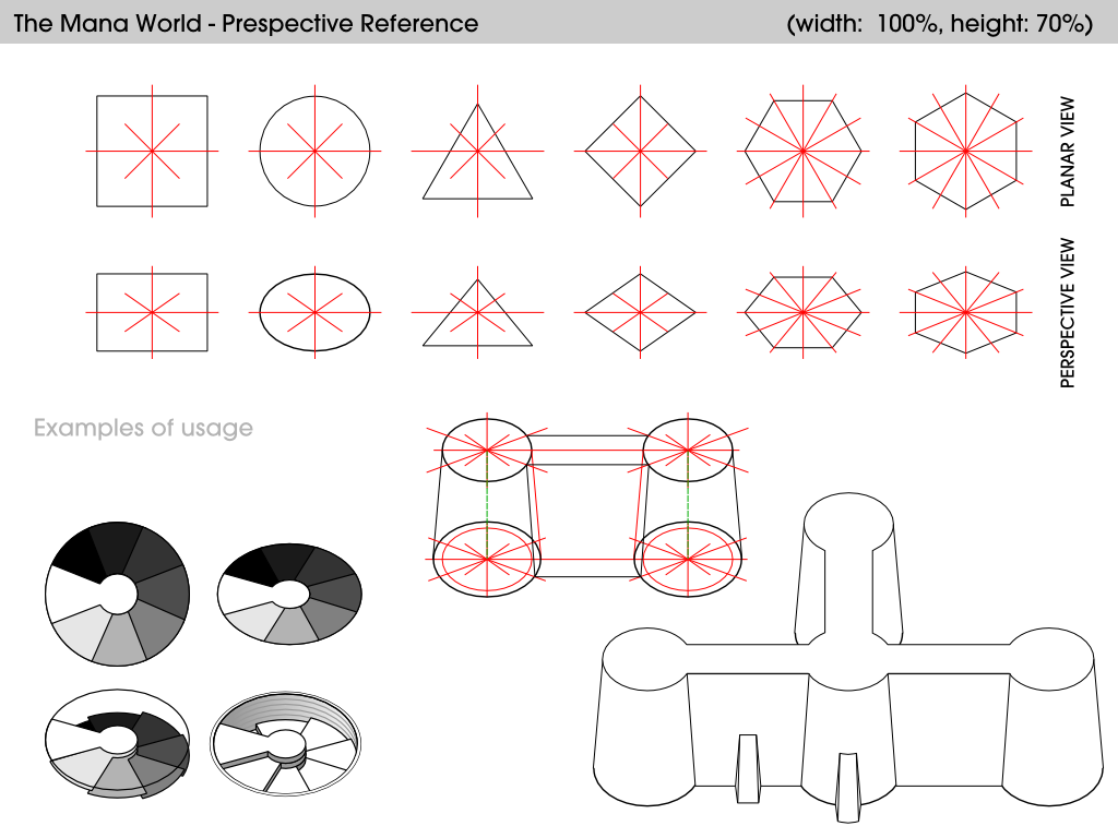
The perspective reference image by Irucard:
Posted: 09 Oct 2007, 07:51
by ElvenProgrammer
Yeah saturation down and darker outline could really improve this one.
Posted: 09 Oct 2007, 17:58
by The Judge
The turtle would be a great source to drop that green armor thats floating around the wiki if it ever gets finished....and if the turtle ever gets finished.