My first tile
My first tile
Last edited by Pajarico on 21 Jun 2005, 10:15, edited 1 time in total.
- ElvenProgrammer
- Founder
- Posts: 2526
- Joined: 13 Apr 2004, 19:11
- Location: Italy
- Contact:
More contrast:
Same as above plus a red vein:
Added some more leaves:
More outline:
Same as above plus a red vein:
Added some more leaves:
More outline:
Last edited by Pajarico on 21 Jun 2005, 08:17, edited 1 time in total.
- Modanung
- Grand Knight
- Posts: 1719
- Joined: 20 May 2005, 15:51
- Location: Groningen, The Netherlands
- Contact:
Nice, very nice.
But I agree it's too blurry.
This thread starts to remind me of Johnny the Homicidal Maniac, who is being discribed as "wacky" in one cartoon...
Anyway, yeah, add more detailed structure, not just a contrast filter.
Oh, and I don't really like the red vein, in a way I do, but in a way I don't.
But I agree it's too blurry.
This thread starts to remind me of Johnny the Homicidal Maniac, who is being discribed as "wacky" in one cartoon...
Anyway, yeah, add more detailed structure, not just a contrast filter.
Oh, and I don't really like the red vein, in a way I do, but in a way I don't.
If you're looking for 3D FOSS games be sure to check out LucKey Productions on itch.io
- Modanung
- Grand Knight
- Posts: 1719
- Joined: 20 May 2005, 15:51
- Location: Groningen, The Netherlands
- Contact:
Ok, that case I'm really sorry I said that.Pajarico wrote:What makes you think i did?Anyway, yeah, add more detailed structure, not just a contrast filter.
I didn't!
Still I think it could use a more sharp structure.
If you're looking for 3D FOSS games be sure to check out LucKey Productions on itch.io
- Bjørn
- Manasource
- Posts: 1438
- Joined: 09 Dec 2004, 18:50
- Location: North Rhine-Westphalia, Germany
- Contact:
A really simple way to get rid of the blurry look, is to scale it down. I think the original looks fine at half its size in the following picture, even though the stone would fit better in a more grassy area.
So Pajarico can basically produce the graphics the way he does, with the blurry result. If he just makes it twice the intended size in pixels, it can be scaled down and should look fine most of the time.
About the grass tiles this stone was showed on above, I think they look great but it's really a different style that the rest of the graphics. Maybe scaling it down to half the size will also make it fit better, as I think the grass blades are too big and lack detail at this size.
Scaled down:
dw
no offence bjorn, but the graphics Pajarico and Sull made are the ideal graphics for a Secret Of Mana Oriented game...
Im pretty sure when everyone heard of the project (atleast the ones who played SoM) expected more over SoM Graphics style :l
But i do agree it doesnt go with the deset tileset.
Im pretty sure when everyone heard of the project (atleast the ones who played SoM) expected more over SoM Graphics style :l
But i do agree it doesnt go with the deset tileset.
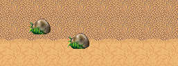
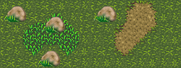
I'm on the nth preview and still don't know what people mean with too blurry.
I mean, we don't have a predefined style. And in top of that (more important) is a rock.
If i was drawing wooden furniture and you told me "is too blur" that doesn't tell me anything, a good critic would be "is too blur, it doesn't look like wood, emphasize the light tones in the vein, etc.
Say "Make it less blur" to five different people and you will have five different versions.
And I can even accept that in some cases but not for something like a rock. I mean what is a rock? how many rocks have you seen in your life? sure you haven't found two rocks that are equal... rocks can be any color, size, shape and aspect. So, how could you say it's too blurrry? too blurry in comparation with what? does that mean that you can find a rock in the nature with that texture? hell, no.
Please, constructive analysis
- Modanung
- Grand Knight
- Posts: 1719
- Joined: 20 May 2005, 15:51
- Location: Groningen, The Netherlands
- Contact:
If it were a magnification of a rounded pebble it would be good.
Most rocks of that size I've seen were more... bumped, rough. They were more broken of and scratched and grown with moss.
What most of them looked like.
Most rocks of that size I've seen were more... bumped, rough. They were more broken of and scratched and grown with moss.
What most of them looked like.
If you're looking for 3D FOSS games be sure to check out LucKey Productions on itch.io
-
- Novice
- Posts: 184
- Joined: 10 Mar 2005, 00:58