Hi,
overall I like this new one, however:
- The clothing and the bow handling are a bit too neat/grid-like (as pointed out earlier). Perhaps you could tilt the cap and the bow a little? Or add traces of hair underneath the cap?
- The left arm looks thin and a bit odd. It is, however, the only thing that makes this one look non-MPS0 (Male Player Sprite #0).
- Perhaps you can increase the MPS0 difference a bit more? Shuffling the feet a little, tucking the right hand's thumb in his belt?
As for the colours:
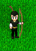
- archer-in-the-green.png (10.71 KiB) Viewed 4428 times
Note that the red feather looks a bit odd; you might want to make it stand out a little more (I'm not completely sure that the shape works either.)
The bow doesn't have an outline and thus looks strange in comparison.
The choice of green is at the darkest end of the set of colours that could work. I personally would make it a bit lighter-- not too much-- so that you have more contrast in which to make the shirt and tights look less flat.
EDIT: I haven't tried the new one. Paste it in front of a forest screenshot, that should tell you whether the colours work. You do need to put more contrast into it, though, to reduce the flatness.
-- fate.


 Photobucket