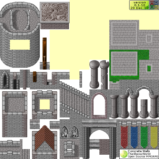
Crush wrote:Regarding the design by Yuuki:
There are practical reasons for using 16 pixel divisions instead of 32 pixels.
It has a lot of advantages for the mapper when a wooden board is used as a tile divider because it allows to apply a decoration to the white part with one tile. But when using a 32 pixel division and putting the board on the tile edge you would need an end tile that is just a few pixel wide which is very unpractical. I made this mistake with the woodland village tileset and I don't want to repeat it.
When using a 16 pixel division on the other hand you can have a board as a divider between two tiles and still have an edge tile that uses more than half of the tile.

There are a good deal of time savings in mapping to be wrought from your suggestions, though I'd note a few things:
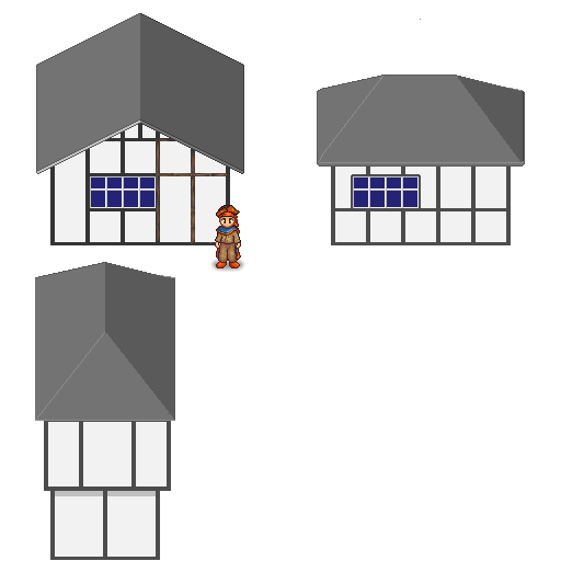
1] The building heights that yuuki used are much more appropriate relative to the pc/npc size.
2] (the real reason I'm making this post) There's a major, major misconception that a lot of people get, going into pixel art, and that is the misconception that whatever their tile size is should act as the "unit size" for everything in the game. That is to say, they feel compelled to make most objects a full tile wide, without leaving blank space between it. They also are afraid of having sections of tile art that can't be broken apart into single tiles - they're afraid of having large, say, 64x64 chunks that can only be used together as a 64x64 chunk.
The danger that comes from this is that it makes one's tile art look very stilted and artificial. I would strongly suggest taking a different tack at things; at drawing more organic shapes while ignoring any of the constraints of having to chop them up as tile art, and then after they are drawn and look good, modifying them to be more modular and reuseable. In my experience, it has really helped to make my tile art look a lot more natural.
3] One thing that would improve all the tile art in your game, and give it more of that "classic SNES/Squaresoft feel" would be to use a full gamut of luminosity values in all color regions in your art. Color regions would be different materials, such as the white stucco areas of the above houses, or the stone foundations, or the brown roofs. And what I'm suggesting is that you have a range of different brightnesses of each areas color, in each area, that go all the way from nearly white, to nearly black.
One might think that this would make everything equally bright, but it doesn't - the trick is to make the
distribution of the different brightnesses different for each region. That is, the darker parts like the roof would most be the dark parts of their color set, using their highlight colors very sparingly, only on the tips of roof shingles. Whereas the stucco walls would use their color set's dark colors very sparingly.